Overview of Wizdom’s page layout designs
Wizdom features a collection of 13 page layouts which are templates that determine how a page should look and how content should be placed. Eight templates for content pages and five templates specifically designed for, respectively, the Handbook and the Corporate News module. Every template offers a different composition of content.
The eight layouts for content pages:
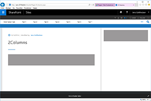
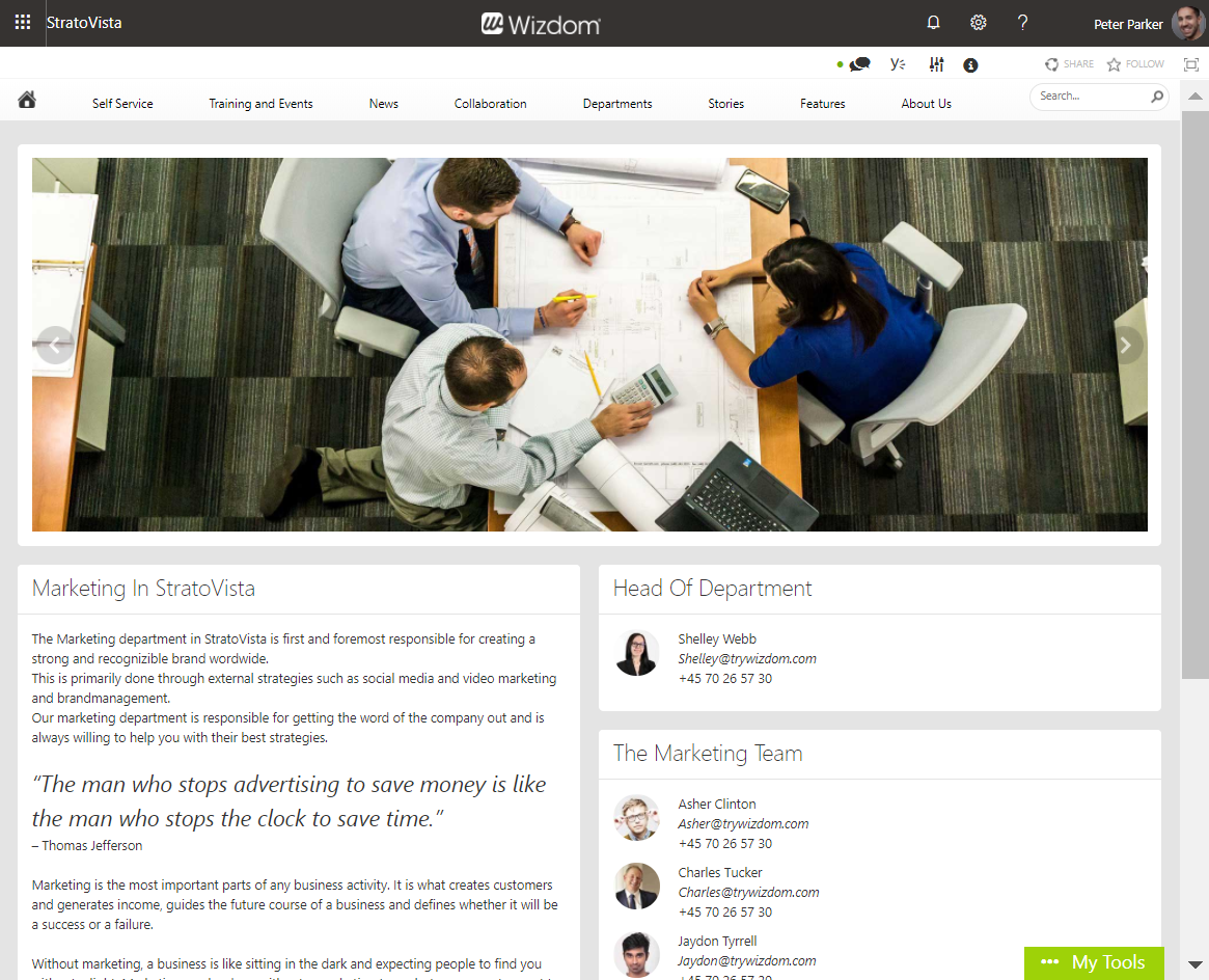
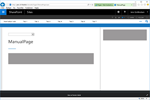
The 2 columns page layout presents the page content in two columns, the left column being the widest. This template, also, automatically displays the page title as a header and includes an area for content in the top of the page.
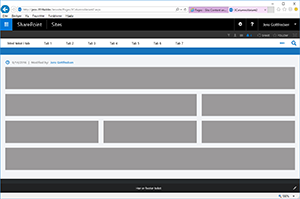
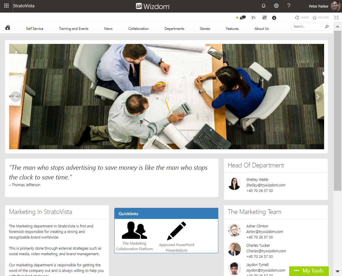
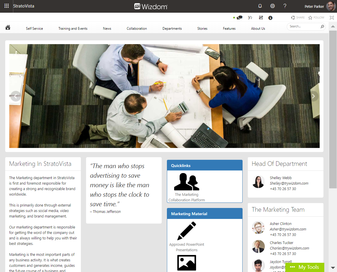
This template orders content in one and two columns. This e.g. allows for a wide header picture.
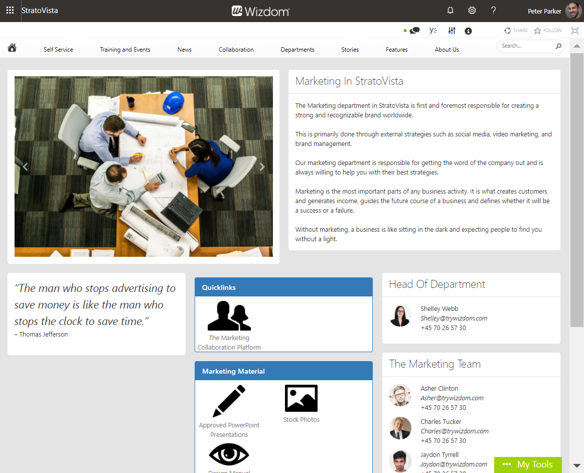
The 3 columns layout offers three columns for your content. The column in the middle being the widest.
This page layout offers one, two, and three columns, allowing you flexibility to shift between number of columns on a page.
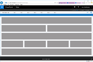
This template offers you to use a combination of one and three columns on the same page.
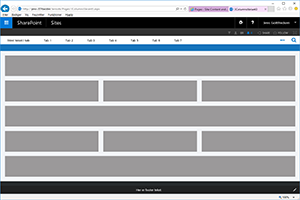
The three columns variant four layout offers a combination of one, two, and three columns that differs slightly from the ‘3 columns variant 2’ layout.
Page layout for the Handbook module:
The layout for Handbook pages. The layout has the same composition as the ‘2 columns’ layout, but, also, includes the page controls unique for Handbook pages.
Page layouts for the Corporate News module:
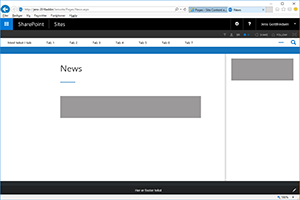
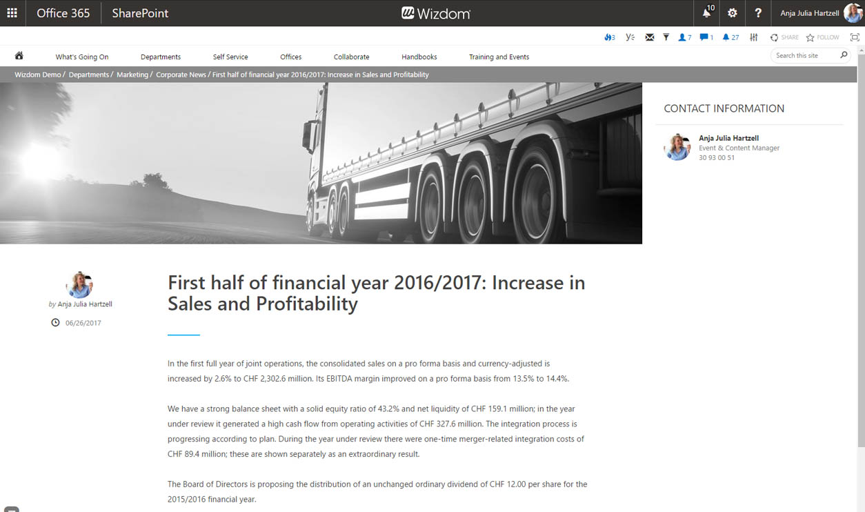
The ‘News’ layout is the default template for news pages. This layout offers the most basic elements of a news page.
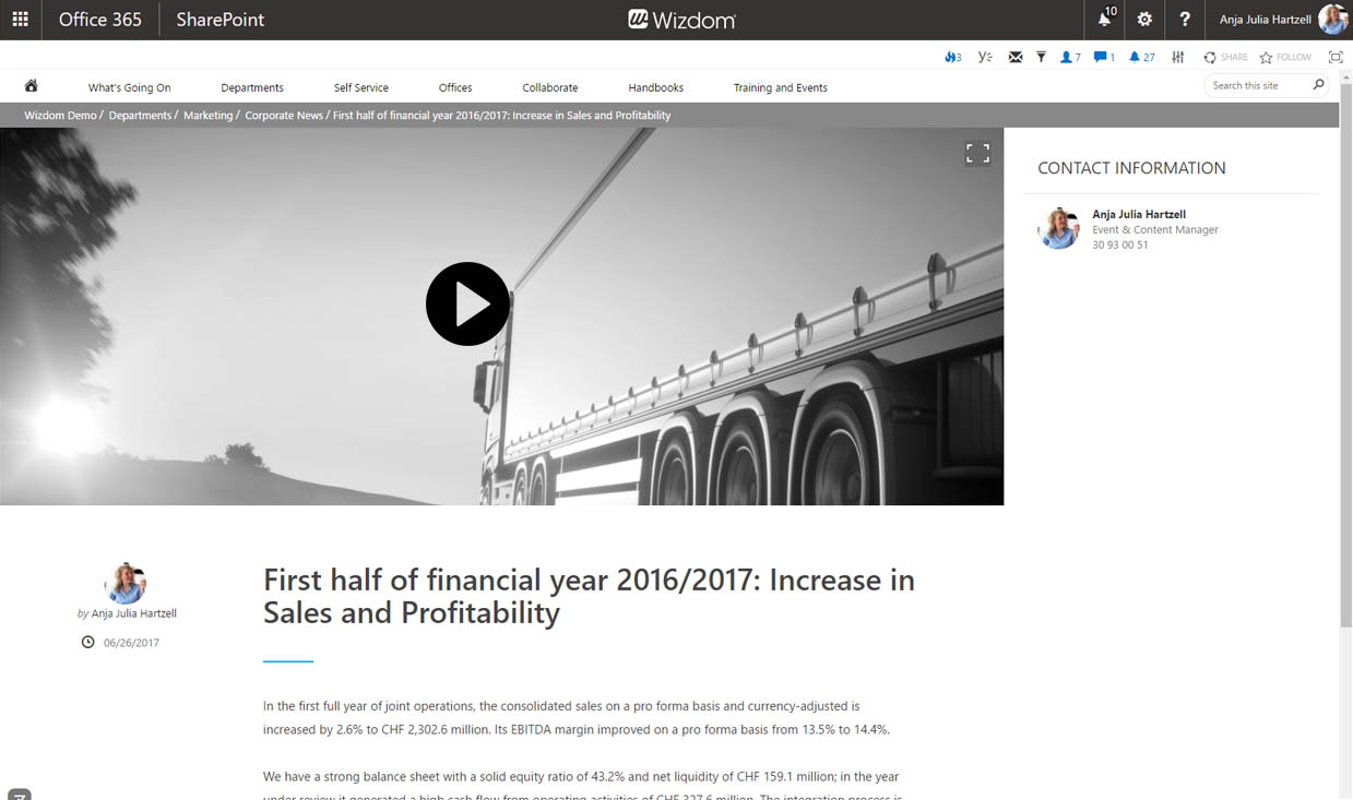
The ‘News with video’ layout offers the same elements as the ‘News’ layout, but, additionally includes a video field.
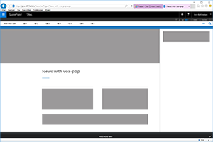
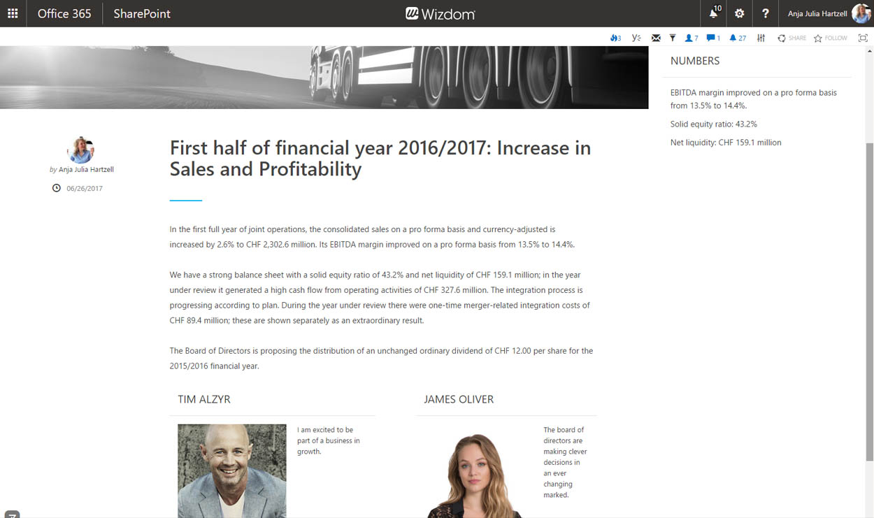
The ‘News with vox-pops and fact box’ layout is an extended version of news page. With fields for two vox pops/quotes including pictures and an area to display ‘facts’, this layout is meant to accommodate a journalistic approach.

