Service Menu module settings
In this article
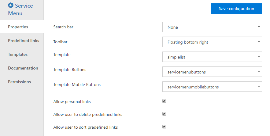
From the Wizdom Configuration Center > Modules > Service Menu, you can configure the following properties:
Search bar lets you select the type of search bar you want to display. Options are collapsed, expanded and none.
Toolbar lets you select the type of service menu you want to display. Options are floating bottom right, integrated topside and none.
Template lets you select a different template that defines how the links are displayed when opening the service menu. We recommend having this set automatically based on the toolbar type and not change it unless it’s for a custom template.
Template buttons lets you select a different template that defines how the service menu button is displayed when either type is selected in the toolbar property. We recommend having this set automatically based on the toolbar type and not change it unless it’s for a custom template.
Allow personal links will allow users to add their own personal links that only they can see.
Allow user to delete the predefined links will allow users to delete links that was added by an editor.
Allow user to sort predefined links will allow users to sort links that was added by an editor.
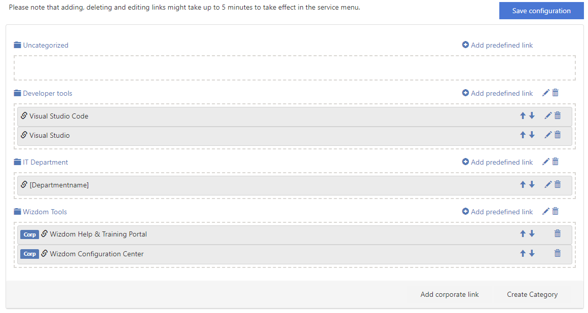
From the predefined links tab, a module administrator can do the following:
- Add predefined link enables an editor to create links that are visible for all users or a targeted user or group.
- Add corporate link enables an editor to add links from a list of Corporate links.
- Create category enables an editor to define categories in the web part.
Searchbar templates
Collapsed is in the top right on the same level as the Wizdom Mega Menu and opens downwards.
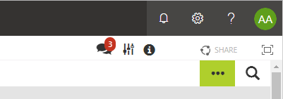
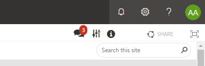
Expanded is in the top right on the same level as the Wizdom Mega Menu and is already open.
Toolbar templates
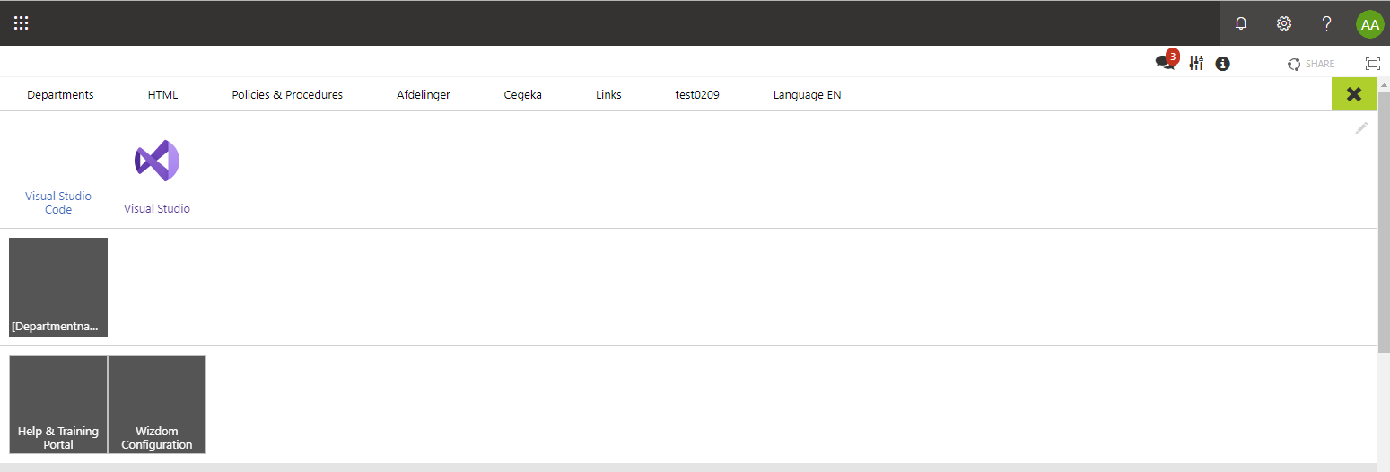
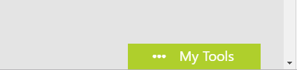
Floating bottom right is in the bottom right corner and opens in a panel from the right.
Collapsed is in the top right on the same level as the Wizdom Mega Menu and opens in a panel downwards.

Templates
When using images, we recommend you use optimized images for web with page load and performance in mind.
When not using rounded images, a size of 110×110 pixels is recommended and you need to consider how to tackle both image and text in the template. You should have something that resembles 50px margin at the bottom of the image to ensure that the text is visible.
When using rounded images, a size of 50×50 pixels is recommended.
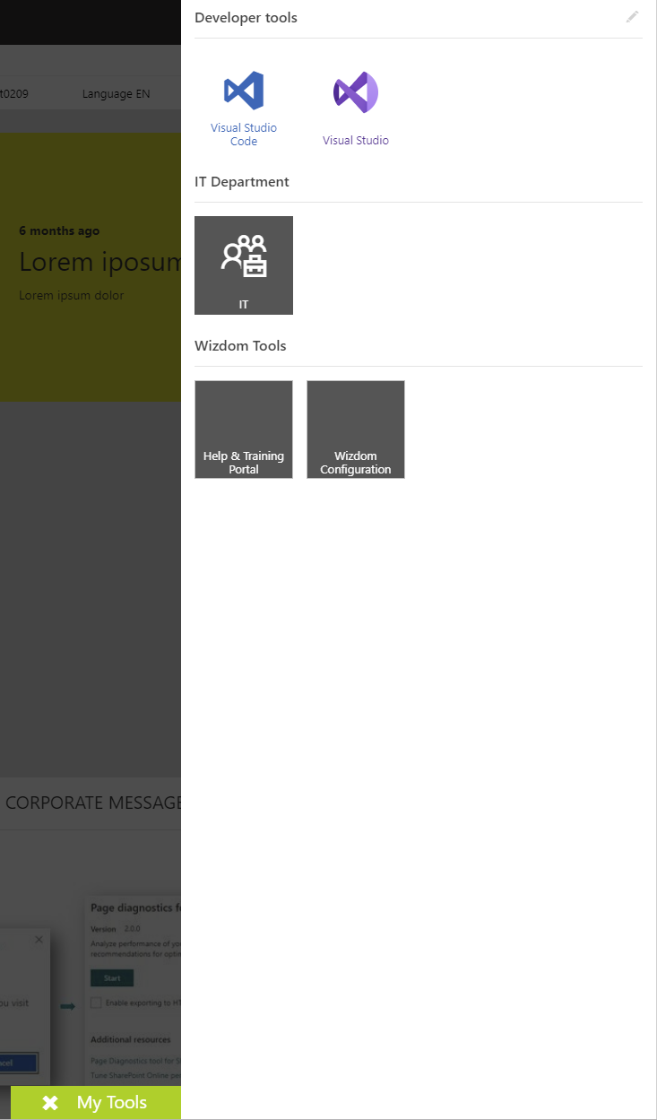
CategorizedList is used with the floating bottom right toolbar where a panel opens form the right. It displays both categories and links
It supports icons, images, rounded images, background color and colors when adding links.
SimpleList is used with the integrated topside toolbar where a panel opens downwards. It displays only links and categories are separated by a divider
It supports images, rounded images, background color and colors when adding links.
It does not support icons.