Forms web part settings
Adding the Form web part to a page
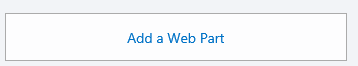
To add the web part to a page, edit the page and click “Add a Web Part” in the zone where you want the form to be:
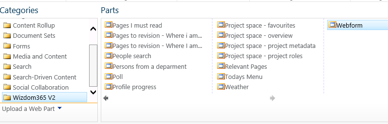
Now choose the Webform web part in the Wizdom365 V2 category in the web part gallery, and click “Add”.
Configuring the Form web part
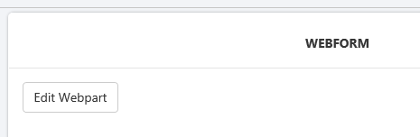
Once the web part is placed on the page, click “Edit Webpart“.
The ‘Edit web part’ page has to tabs: the Form and the List tabs.
The Form tab shows the form designer, and the List tab is where you specify in which list to save the data, when users have filled in and submitted the form.
Using the form designer
The form designer is divided into three sections: “Toolbox”, “Formular” and “Field settings”. You drag fields from the toolbox to the formular and then configure the field details in the “Field settings” area.
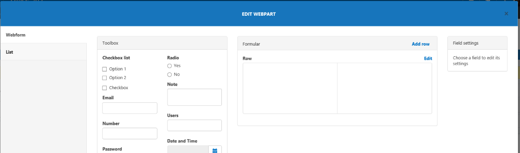
Rows and Columns
The formular is divided into rows and each row is divided into columns. To add a row click “Add row”, and to edit a row click “Edit”. You can now change the number of colums in the row.

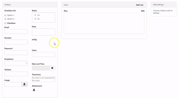
Adding fields
You add a field of a given type by dragging it from the toolbox and dropping it in the column where you want it. You can now specify the field detalis by clicking ”Edit” on the field. In the example below a “Textbox” field is placed in the left hand column:
List settings
In the list settings you can specify in which list to save the data when users have submitted the form. Specify the list name and click “Save” to save all the web part information.
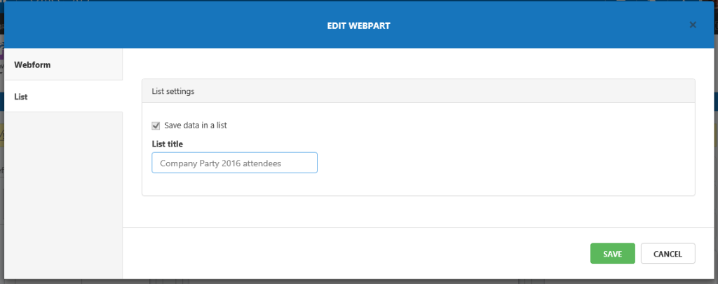
When you click “Save” the Webform web part will automatically create the list and add the fields corresponding to the fields you have added with the Form Designer.
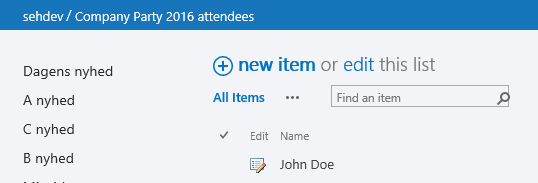
The simple form that we have now created contains only one field “Name” of type “Textbox”. When we save the web part settings and publish the page, the form will look like this:

The list with the field “Name” of type “Text” is created in the site where the Webform page is created. If a user writes the name “John Doe” in the field and clicks “Submit”, an item is added to the list with the content “John Doe” in the field “Name”:
Field types
Below, each supported field type is described along with the customization options for it. Some field settings are available for all or most field types. These are:
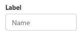
The Label is the field’s headline in the web form. It is also the name of the field in the SharePoint list where the data is saved
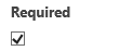
The Required option is avaiable for all field types except the Checkbox type. If a field is required it is not possible for the user to submit the form until this field is filled out. Required fields are marked with a asterisk.
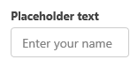
The Placeholder text is available for fields where the user is supposed to type in text. It may be used as a guide for the user in regards to what kind of information the field is supposed to contain. In the example ablove “Enter your name” is the placeholder text.
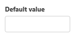
The Default value is available for several field types. If a default value is specified the form will contain this value when shown. The user may keep the default value or change the value to something else before submitting the form.
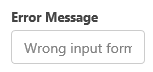
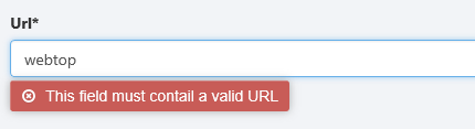
The Error message is the message shown if the field does not meet the validation requirements.
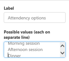
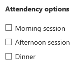
The Checkbox list is a field that may contain multiple predefined values. When presented in the form the field looks like this:

The Checkbox field is the most simple field type. It has only a label and a default value. The value may be true or false.
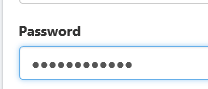
The password is a special version of the textbox field. When typing data into the form the data in this field are not shown.
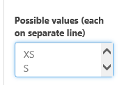
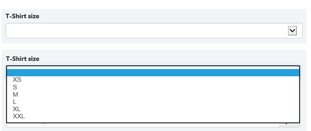
The Dropdown field shows a list of selactable values as specifield in the “Possible values” field in Field settings. On your intranet, it may look like this:
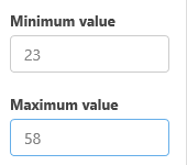
The Number field is a field that can only contain numbers. Besides the generic settings options as Label, Placeholder text, Required and Default value, it may also be configured with a minimum and maximun value. If the min. and max. values are not met, the user cannot submit the form.
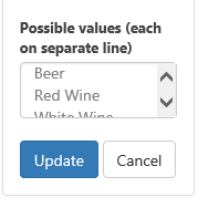
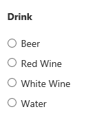
Radio button, where you need to specify the valid options for the button type field in the “Possible values” field, in order to make it look like this on Your intranet:
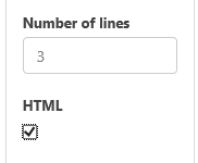
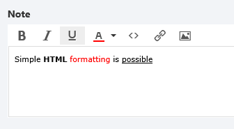
The Note field is multiline text field that also has the option of being in HTML format. If HTML is specified, the user gets a simple HTML editor when filling out the field:
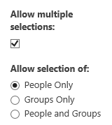
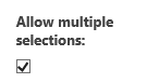
The Users field add a User or Group picker to the form. It is possible to specify whether users, groups or both may be selected, and also if multiple selections are possible.
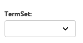
The Taxonomy field enables the user to select one or more values from one of the term sets defined in SharePoint. Select one of the termsets displayed in the list.
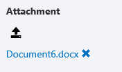
On the intranet, the user gets a download icon, which makes possible to select the file(s) to attach:
When the users have filled in and submitted a form, the data is saved in a SharePoint list of your choice.
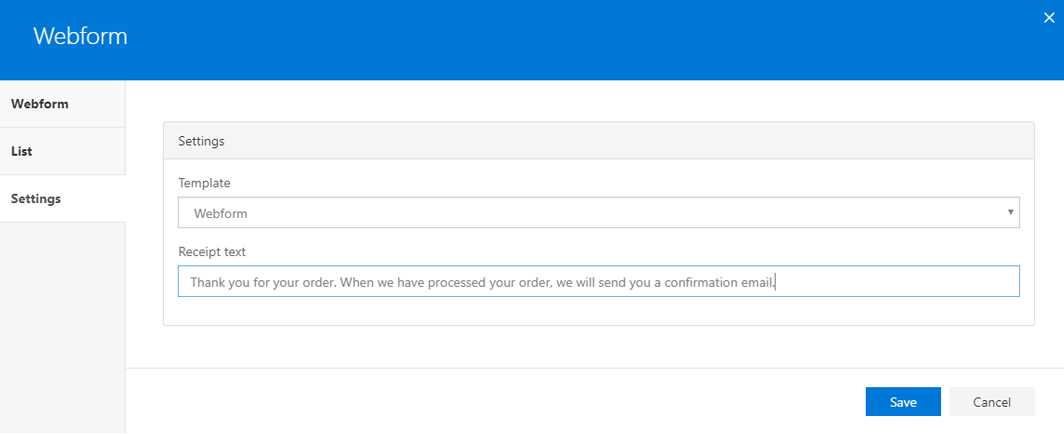
General settings
Under ‘Settings’, you define the template of the web part.
The field ‘Receipt text’ allows you to compose a confirmation text that will be displayed to users upon filling out the form successfully.