Image Slider web part settings
Creating a library for your intranet images
The Image slider can use SharePoint’s Assets Library, Picture Library, and the preprovisioned Images Library.
To create a library, perform the following steps:
1) From the site, where you want the library to be located, click on the settings wheel in the upper right corner of your intranet and click ‘Add an app’.
2) On the app page, find the Picture Library or the Assets Library app and click on it.
3) In the dialog box, type a name for the library and click create.

Configuring the Image Slider web part
To add the Image Slider web part to a page, perform the following steps:
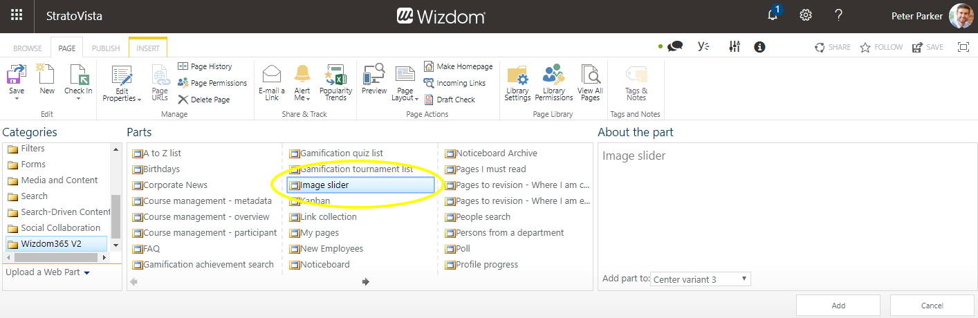
1) Edit the web page and click ‘Add a web part’ to open SharePoint’s web part gallery.
2) The Image Slider web part is found in the ‘Wizdom’ folder.
To set up the Image Slider web part, perform the following steps:
1) Press the ‘Settings’ button in the web part. A window pops up and takes you through the settings.
In the field, Site of image library, you choose the site where the library, you want the Image Slider to display images from, is located.
In the field, Image Library, you choose the library you want the Image Slider to display images from. (the Image Slider can display images from SharePoint’s Picture Library, Assets Library, and preprovisioned Image Library).
Sort by allows you to change the order in which images in the slider are presented. Per default, images are sorted by modified date descending.
Max number of images defines the number of images that the image slider will display. E.g. entering 5, the Image Slider will only display five images even though the library contains 10 images.
Image height will set the a fixed height of images in the slider. The height is set in pixels. When you set the image height, and not the width, the image width will fill the web part and the image slider will be responsive.
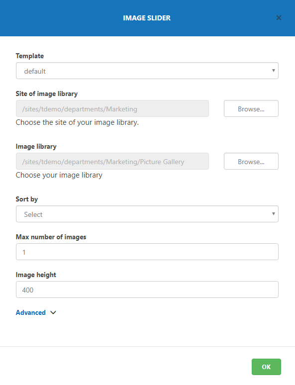
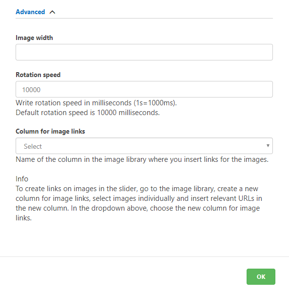
Image width lets you control the width of images in the slider. However, setting an image width will give a fixed, non responsive, experience of the picture. The width is set in pixels.
In the Rotation speed field, you define the speed in which the Image Slider slides images. The rotation speed is set in milliseconds.
Column for image links allows you to link images to a page. You will need to create a column in the Picture Library for image links and insert relevant URL’s for images in the Picture Library.
After this, you select the column you have created for image links in this field.

Adding links to images in the slider
This is done by adding a column for the URL address in the library, filling this field out with the appropriate URL for the images you want to make clickable, and set the Image Slider web part up to include this URL on images.
Perform the following actions:
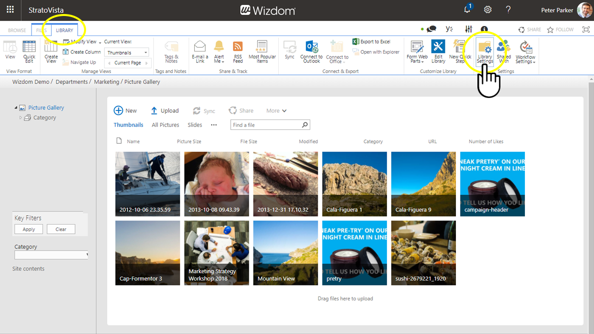
1) From the library, activate the tool bar by selecting the ‘LIBRARY’ tab. Then click on ‘Library Settings’.
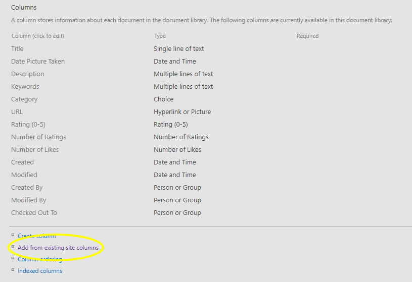
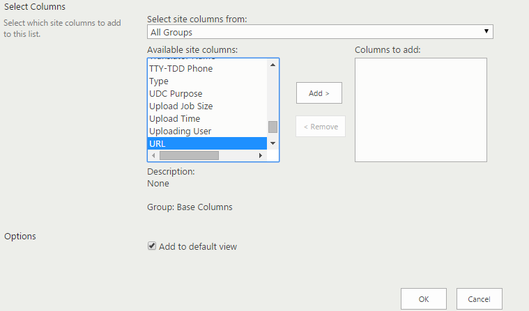
a) Clicking ‘Add from existing site column’, you can add the standard SharePoint URL column by selecting it among the available site columns.
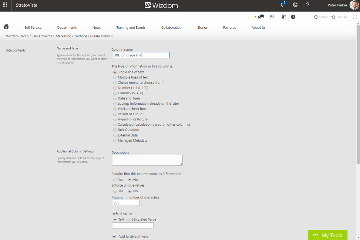
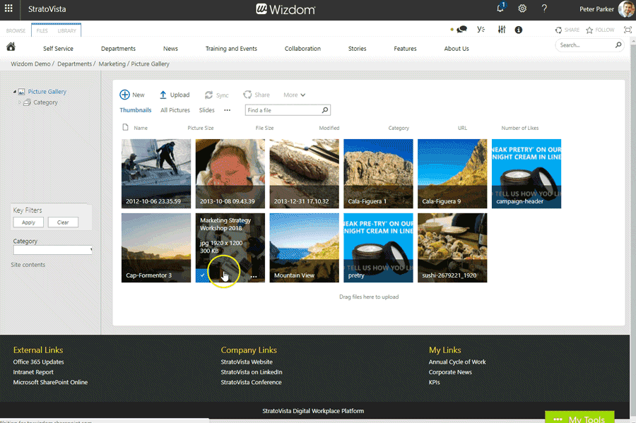
Here, you select the column, you have created for the URL address, in the field ‘Column for image links’. E.g. if you have named the column ‘URL’, you simply select the column called ‘URL’.
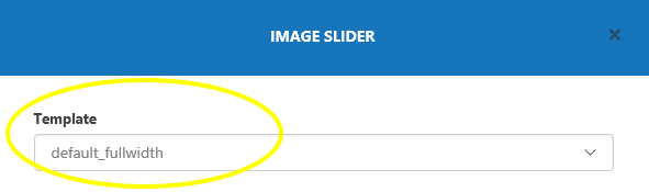
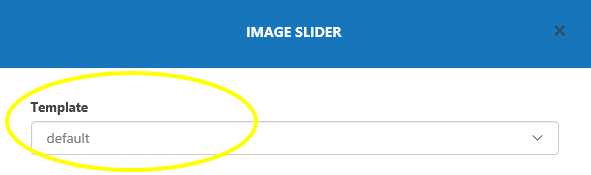
Overview of templates for the Image Slider web part
The template ‘default’ is intended for smaller image sliders on pages. The template displays images with squared corners.

The template ‘default-fullwidth’ presents the image with rounded corners. The templated is designed to use for fullwidth banners.