Configuring the Power Panel
To design the Power Panel according to your needs and preferences, visit the Widgets section in the Configuration Center.
In this article
Creating panels
The Power Panel creates an overview of existing content with help from different panels configured by intranet administrators. When panels are created, they form a menu tab located one the left side in the intranet. The Power Panel can be accessed from anywhere in the intranet.
The Power Panel can be described as a dresser where panels are the drawers that must be filled with sections, followed by components. Once panels have been created, they show up as icons that can be folded out in the menu tab on the left side in the intranet.
First, you design your panels:
You can reorganize the order of your panels by drag and drop in the Configuration Center. Panels can be re-designed by clicking ‘Edit‘. To delete a panel, simply press ‘Edit‘ followed by ‘Remove‘.
Add panel
You add a new panel to the Power Panel by clicking ‘Add‘ followed by selecting a panel icon from the list, a panel title, and a panel label (which by default is the same as title). The panel title shows up at the top of the bar, and the panel label is visible when he icon is hoovered.
in ‘Width‘, you choose the size of your section or add a custom width. This will be the width of the section when it’s folded out from the Power Panel on the intranet.
‘Only visible for‘, allows you to target specific audiences and limit the visibility of this specific part of the Power Panel. The sections can be targeted to AD groups or groups created with Wizdom Audiences.

Here shows a panel with ‘Width‘ size small.

Adding sections
Within each panel, there are different sections that must be configured before web parts can be inserted.
Press ‘Show panel‘ followed by ‘Add section‘ to design sections according to your needs. You can edit the section whenever you want by clicking ‘Edit‘.
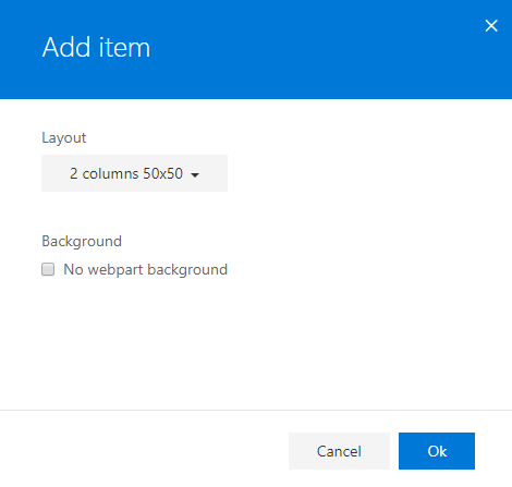
First, design the layout of your section by choosing the appropriate number and size of columns. Sections can consist of one, two, or three columns depending on how much information you want the panel to contain.
Tick the box if you don’t want to include web part background in the panel section. Web part backgrounds are enabled by default, meaning that the colors of the web part you decide to include in your section will remain the same when inserted in the Power Panel
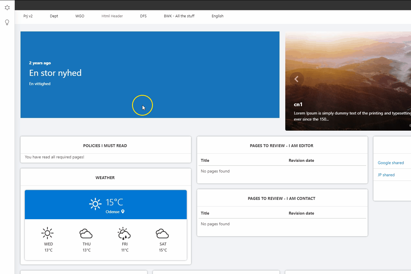
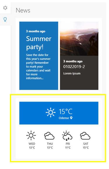
Here shows a panel consisting of one section with one column and two components. Web part backgrounds are included.
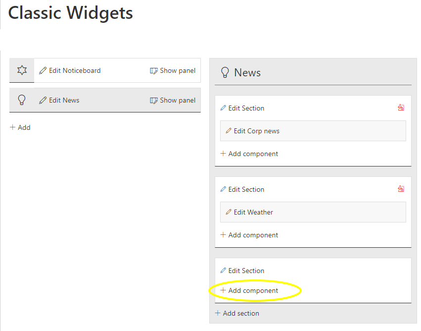
Adding components for classic SharePoint
Each section holds components, which are e.g. the web parts you collect from your intranet and insert as widgets to the Power Panel. Once your components are added to your sections, a panel for the Power Panel is created and visible to intranet users. This can be done in the Configuration Center under ‘Classic Widgets‘.
First, click ‘Add component‘ in the section you want the web part to appear.
To insert a web part to the section of a panel, do the following:
1) Create a page and insert a web part (or choose an existing web part).
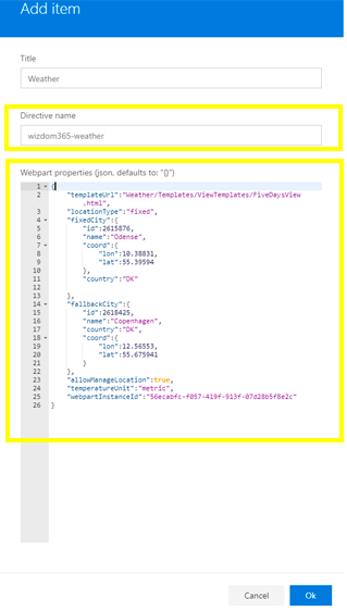
2) Find the Angular directive name and web part properties of the web part you want to present.
These can be found by inspecting a page and showing its elements.
3) Copy the directive name and web part properties to insert them in the component. Only Wizdom web parts and Angular directives are supported.
When all fields are filled, press ‘Ok‘ followed by ‘Save‘ to see the component in the Power Panel. Refresh page if it doesn’t show.