Defining logo, favicon, and other design elements
Note: This functionality is only available on Wizdom for SharePoint Classic.
The Design & Branding module includes tools to define design elements as logo, favicon, header background, and other elements for a site collection, or parts of it, in your digital workplace. In this guide we’ll introduce you to these tools.
In this article
Style behavior

When displaying a web part in SharePoint, the setting, that is labeled ‘chrome type’ in SharePoint, defines whether or not you want to display border and title of a web part.
By default, SharePoint will display only the title of a web part. This means that the chrome type setting that can be adjusted using SharePoint’s web part editor is set to ‘Title only’ per default.
Wizdom changes this default setting to display title as well as border of all web parts. This means that using Wizdom, the default chrome type setting is set to ‘Title and Border’.
To change the Wizdom default setting back to SharePoint’s default chrome type setting do the following
1) Go to the area ‘Style Behaviour’ under Wizdom Style module.
2) Tick the box in line with the text: ‘Follow SharePoint’s chrome type definitions’ and click ‘Save configuration’.
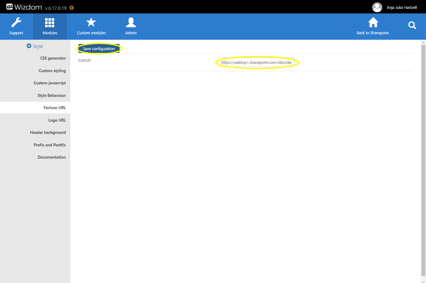
Favicon URL

The ‘Favicon URL’ area in Wizdom Style module lets you set the favicon for your digital workplace.
To set a favicon perform the following steps:
1) Upload a favicon.ico file to SharePoint. It is possible to use a .png file as well, but as internet explorer has issues using .pngs as favicons, it is recommended to use .ico file.
2) Copy the URL of the favicon.
3) Go to the ‘Favicon URL’ area in Wizdom Style module.
4) Insert the URL in the text field next to the text ‘IconUrl’ and click ‘Save Configuration’.
Header background
Perform the following steps to insert a header picture:
1) Upload a picture to SharePoint that you would like to use for the header.
2) Copy the URL of the picture.
3) Go to the area ‘Header Background’ in Wizdom Style module.
4) Insert the URL of the image in the text field called ‘Image URL’.
5) Choose whether you want the picture to be repeated vertically (Repeat y), horizontally (Repeat x), repeated both vertically and horizontally (Repeat), or not repeated (No-repeat).
6) Save Configuration.
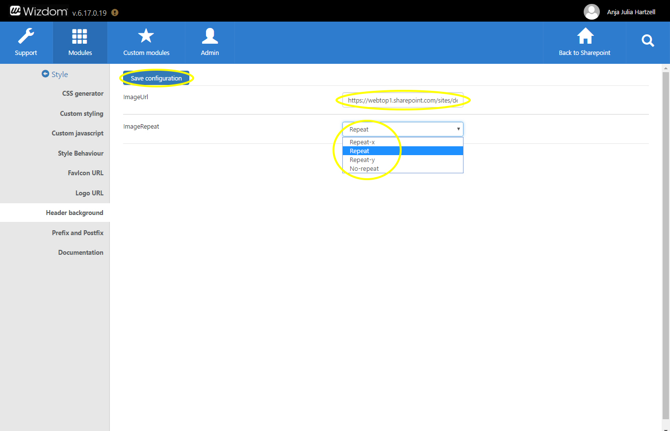
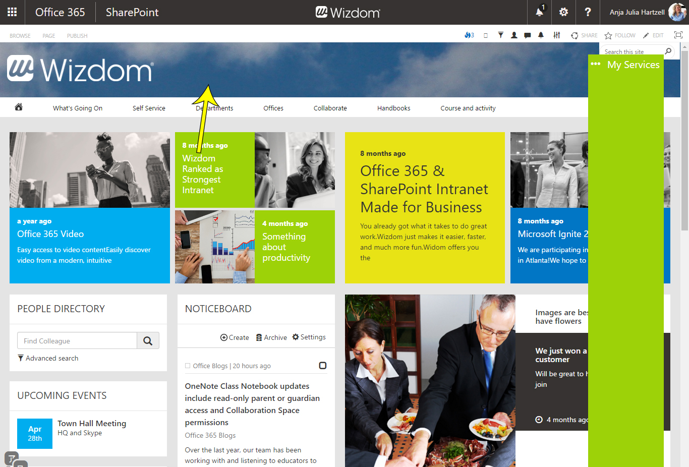
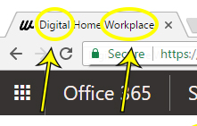
This will create a space in the top part of the screen displaying the header background picture as well as a logo. If no custom logo is set for the site, the default SharePoint logo will be shown.
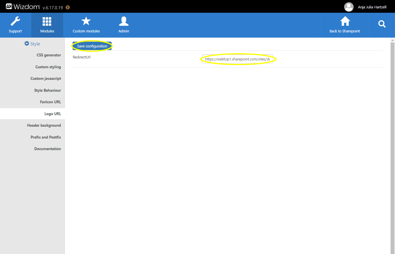
Logo URL
To define the URL of the header logo perform the following steps:
1) Click the ‘Logo URL’ tab in Wizdom Style module.
2) Insert the URL, you want the logo to redirect to, in the text field ‘Redirect URL’ and click ‘Save configuration’.
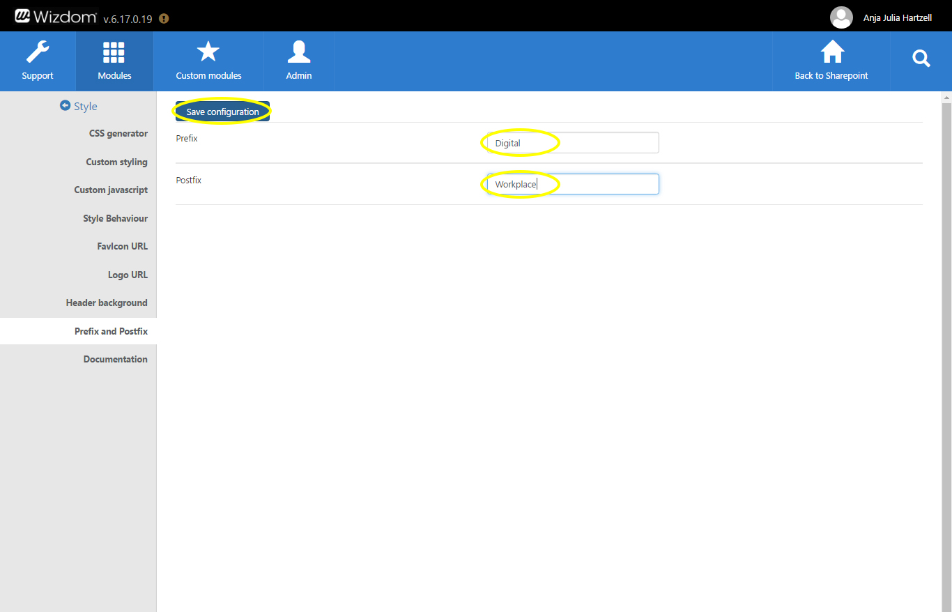
Prefix and postfix
To set a prefix and postfix in Wizdom, take the following steps:
1) Click the ‘Prefix and Postfix’ tab in Wizdom Style module.
2) Insert the text you like for the prefix and postfix and click ‘Save configuration’.