Wizdom mobile app module settings
Wizdom mobile app is set up in Wizdom Configuration Center under Custom Modules. Here you define the content of each tab to optimize the mobile experience for your users.
NOTE: To install Wizdom Mobile App and make the module administration available in Wizdom Configuration Center, the app will have to be set up by either Wizdom Consultancy or one of our partners.
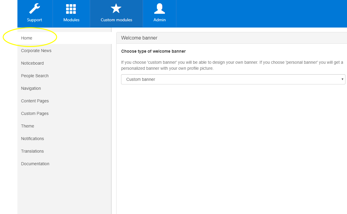
Configuring the Home tab
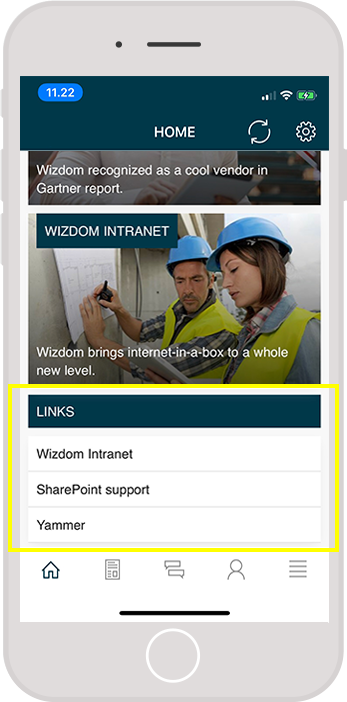
The content of the home tab is the first that meets the user when opening the app. The home tab includes five content components that can be configured to create a mobile experience tailored for your users.
The home tab is configured in the ‘Home’ area of the app administration.
Configuring content component 1: Welcome banner
The welcome banner shows up once the app is opened and greets the user welcome when logging in. The content of the welcome banner can display either a personal banner that does not require any configurations or a custom banner that can be designed with the company logo, for example.
- The personal banner displays a personalized banner with the user’s own name and profile picture.
- The custom banner consists of an image uploaded by the administrators.
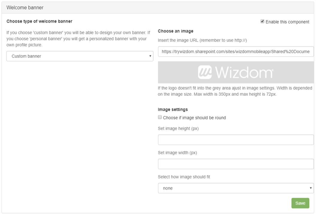
If you want a custom banner, select ‘Custom banner’ in the drop down menu, add an image URL and fill out the settings in the form. Then click ‘Save’ again.
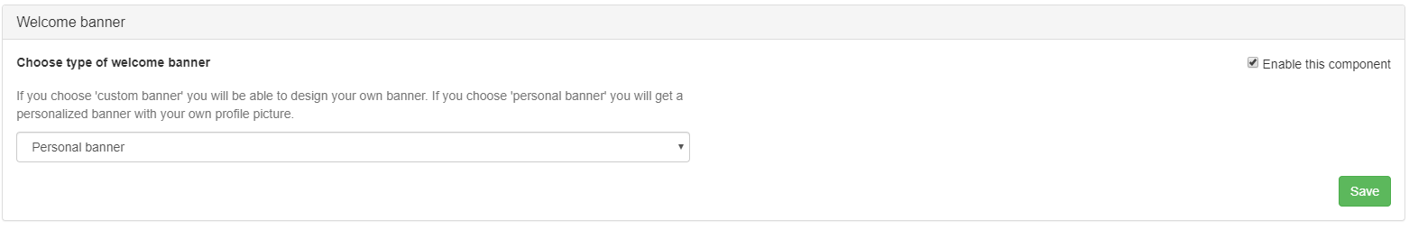
If you want the welcome banner to be personalized, chose ‘Personal banner’ in the menu and click ‘Save’.
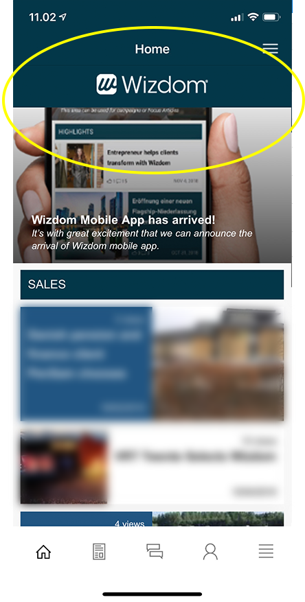
Custom banner
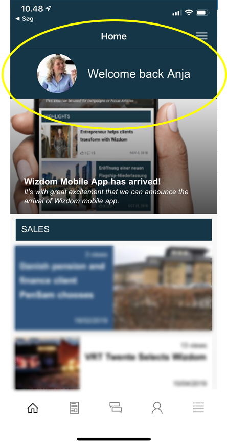
Personal banner
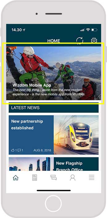
Configuring content component 2: Focus article
The content of the focus article will be presented to users in the top of the home page, just below the Welcome banner. Tick ‘Enable this component’ and ‘Save’ to show latest news in the mobile app. If unticked, the content of this section will not be displayed in the mobile app.
The component supports three different types of focus articles that you can feature:
- News article
- Content page
- URL
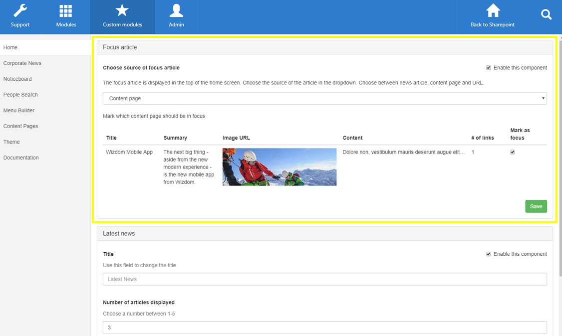
To configure the focus article content:
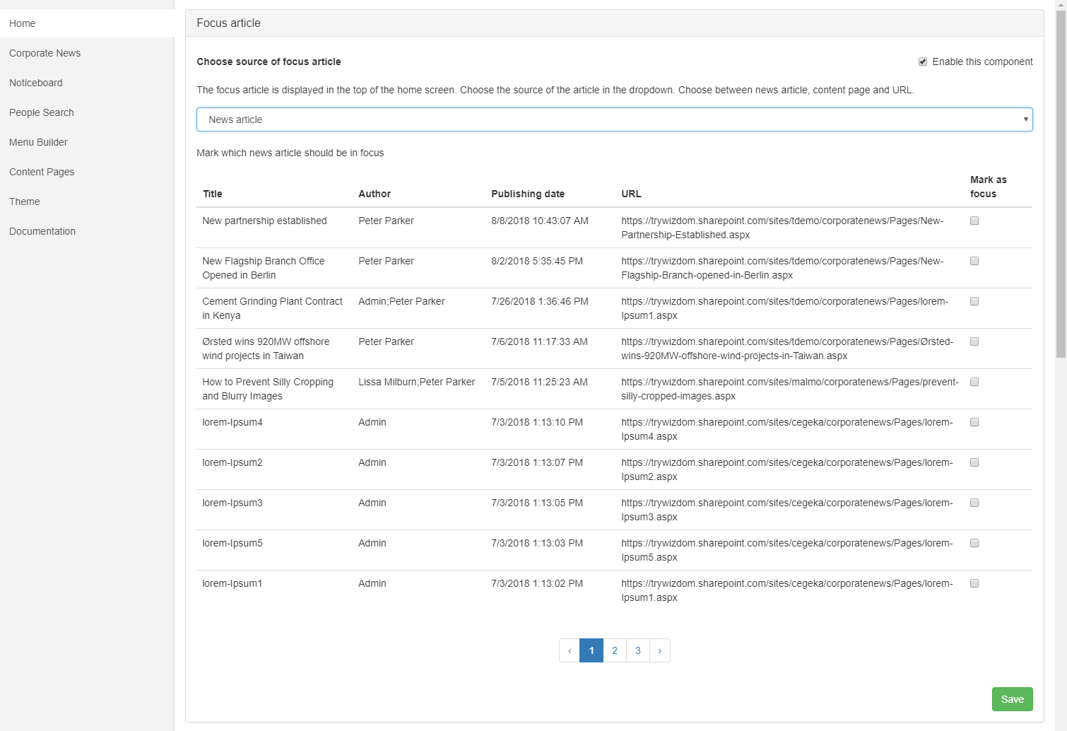
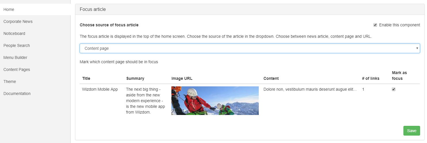
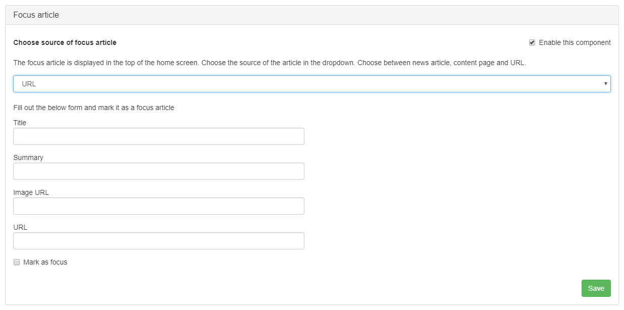
From the focus article area, choose whether to feature a news article, a content page (configured in the content page tab), or to enter a URL of the content you would like to feature.
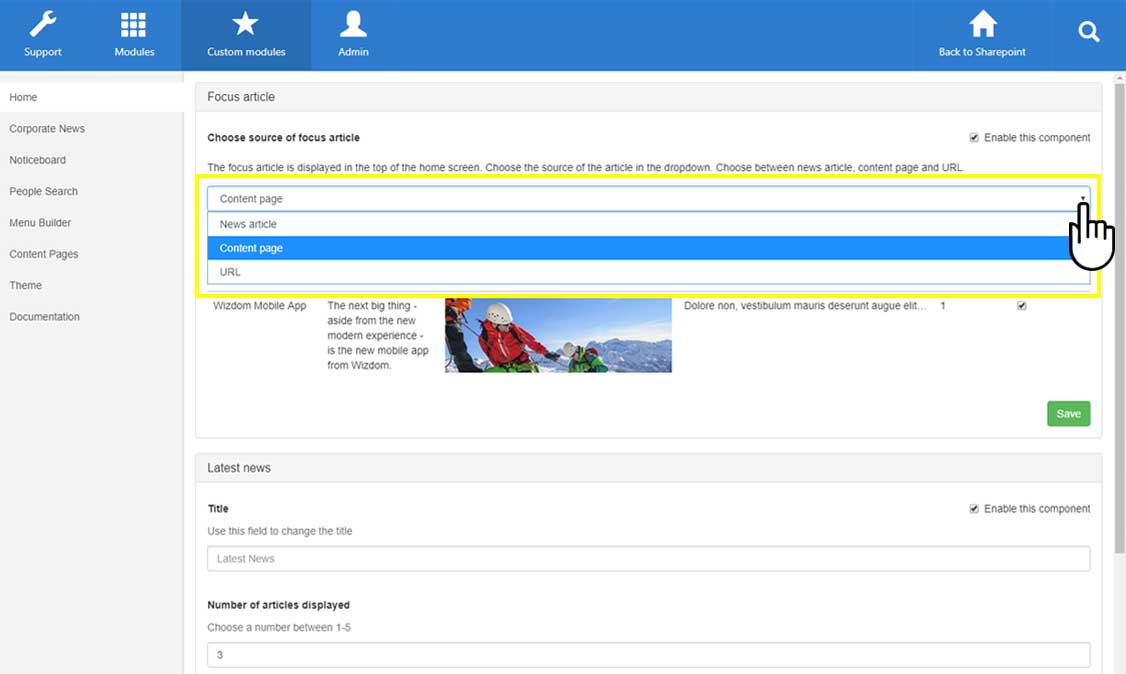
Selecting ‘News article’ will give you a list of the latest news articles where you can check one article, and have it featured in the component. Please note that if you do not have the Corporate News tab configured (explained below), you will not get a list of news articles.
Select the one you wish to feature by ticking ‘Mark as focus’.
Selecting ‘Content page’ you are offered to select between the content pages created in the ‘Content Pages’ tab. Please note that if you have not yet created any custom content pages, no one will be displayed here.
Select the one you wish to feature by ticking ‘Mark as focus’.
Selecting ‘URL’ you select content by pointing to the source of the content – this content can be any online source, also external content.
Enter Title, Summary, Image URL, and URL, and tick ‘Mark as focus’ to feature the content. Click ‘Save’ to have it featured.
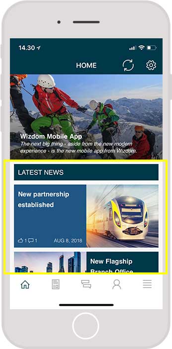
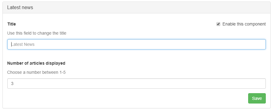
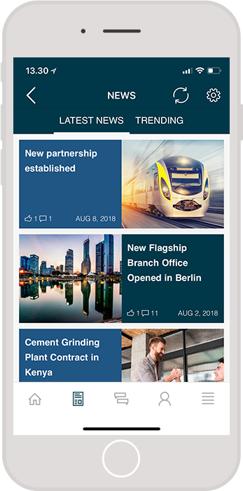
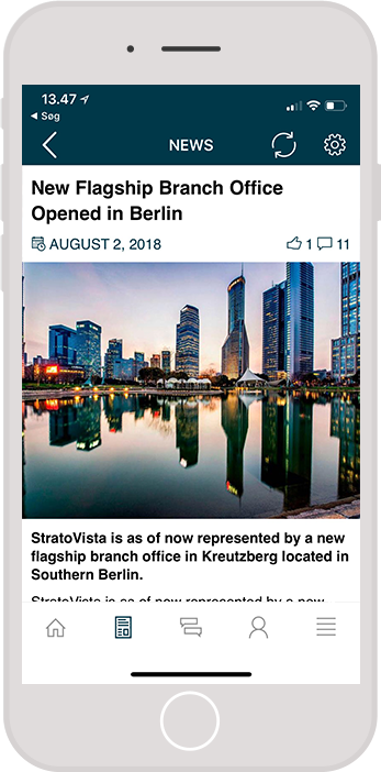
Configuring content component 3: Latest news
Latest news will display the last published Corporate News. The content of the latest news will be shown on the home page, just beneath the focus article content (if this section is enabled).
Tick ‘Enable this component’ and ‘Save’ to show latest news in the mobile app. If unticked, the content of this section will not be displayed in the mobile app.
You also have the option to change the title of the component and decide how many articles you want displayed. We usually recommend having around 3 articles displayed. Click ‘Save’ to save any changes you have made.
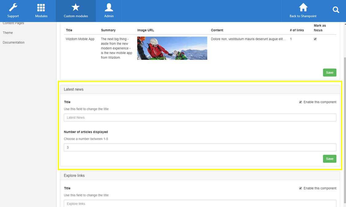
To configure the latest news content:
Title lets you enter a title for the section. If non is entered the default title ‘Latest news’ will be applied.
In Number of articles displayed, you define the number of latest articles you want the app to display. Select between one and five.
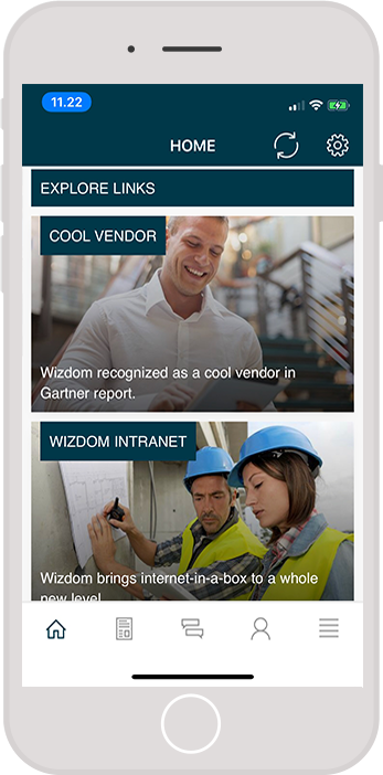
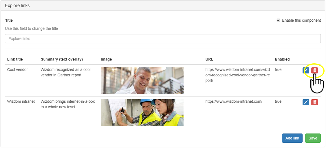
Configuring content component 4: Explore links
Explore links offer you to create visually appealing links to core content and tools. The links will have a background image with title and summary text on top. The explore link section is shown just after the latest news section (if this section is enabled).
Tick ‘Enable this component’ and ‘Save’ to show latest news in the mobile app. If unticked, the content of this section will not be displayed in the mobile app.
Title lets you enter a title for the section. If non is entered the default title ‘Explore links’ will be applied.
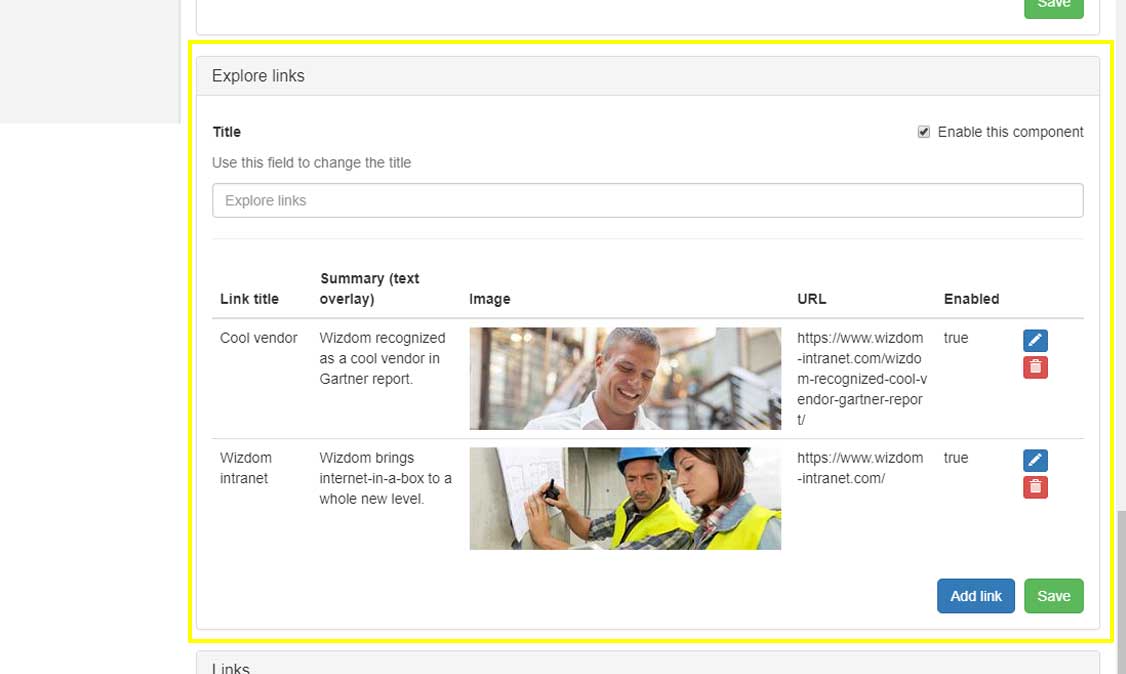
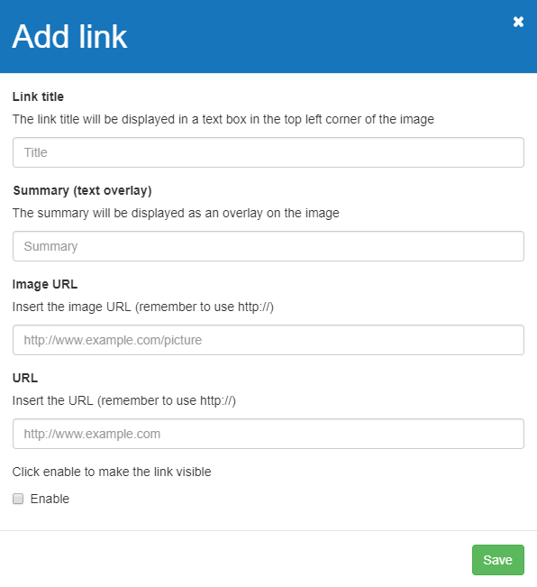
To add an explore link press ‘Add link’.
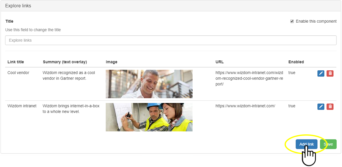
Next, fill in the dialog:
Link title will be displayed in a text box in the top left corner of the background image of the link.
Summary (text overlay) will be displayed over the background image.
In Image URL, you insert the url of the image you use as background.
in URL, you insert the destination of the link.
Remember to click Enable to make the video visible.
Press the edit icon to edit an explore link.
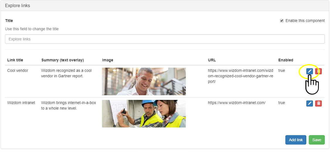
Press the bin icon to delete an explore link.
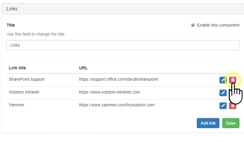
Configuring content component 5: Links
The links section allows you to create simple links to core content and tools. The Link section is shown just after the Explore link section (if this section is enabled).
Tick ‘Enable this component’ and ‘Save’ to show latest news in the mobile app. If unticked, the content of this section will not be displayed in the mobile app.
Title lets you enter a title for the section. If non is entered, the default title ‘Links’ will be applied.
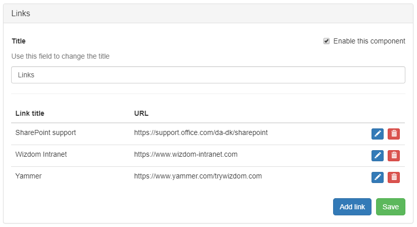
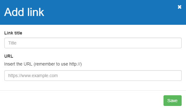
To add a link press ‘Add link’.
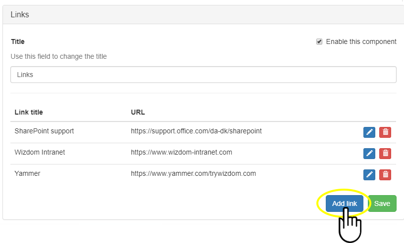
Next, fill in the dialog:
Link title will be the title of the link.
in URL, you insert the destination of the link.
Press the edit icon to edit a link.
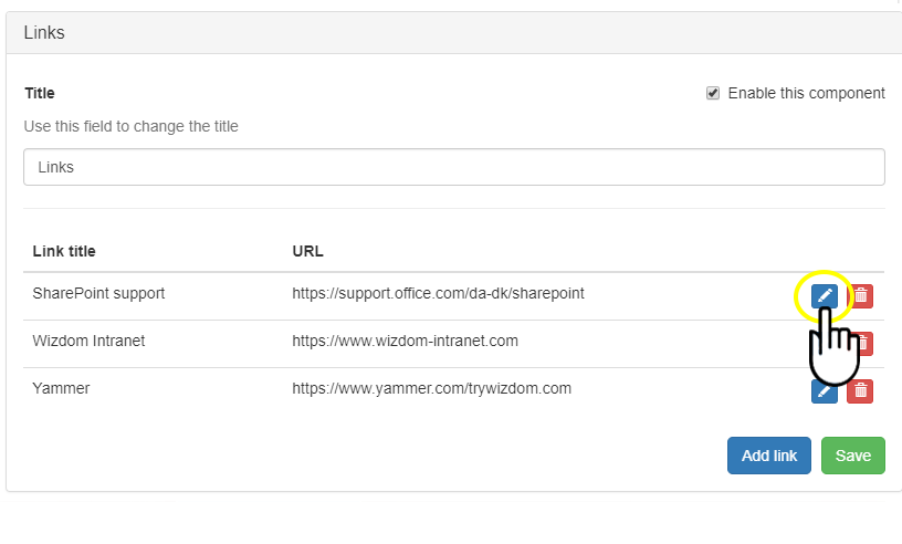
Press the bin icon to delete a link.
Configuring the Corporate News tab
As the name reveals, the Corporate News tab makes available Corporate News. Following the ‘Settings’ section, the tab includes two sections: latest and trending (most read) news that users can change between.
The Corporate News tab is configured in the ‘Corporate News’ area of the app administration.
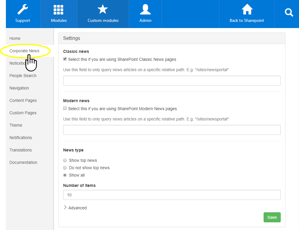
Configuring settings
First, you will discover the settings of the Corporate News tab.
The ‘Settings’ section allow you to configure where you want news to surface from, just like you know it from the Wizdom Corporate News web part settings. These settings are then used throughout the app to display latest and trending news, as well as adding support push notifications on these articles.
Fill in the fields to configure the Corporate News settings:
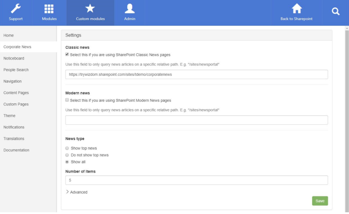
- Classic news should be checked, and the URL should be entered to display news from a Classic news site.
- Modern news should be checked, and the URL should be entered to display news from a Modern news site.
- News type is used to display either or both top news and regular news.
- Number of items is used to select how many news articles are displayed. There is no pagination available.
Click ‘Advanced‘ to configure the rest.
- Order by is used to decide which property the news is sorted by on the Home tab and Latest news tab. Its default value is “LastModifiedTime”, but we recommend changing it to the managed property mapped to the w365_newsdate field
column. Please make sure this property is configured on your environment before using it. Trending news are automatically ordered by the “ViewsRecent” property. - Language filter is used to filter news items based on either User Profile properties or terms.
- Location filter is used to filter news items based on either User Profile properties or terms.
- Department filter is used to filter news items based on either User Profile properties or terms.
- Search result source is used to override the default source from which news articles are queried through SharePoint Search.
- Query mode should have SharePoint Search Based checked.
- Caching should have Per user checked.
Order by is used to decide which property the news is sorted by on the Home tab and Latest news
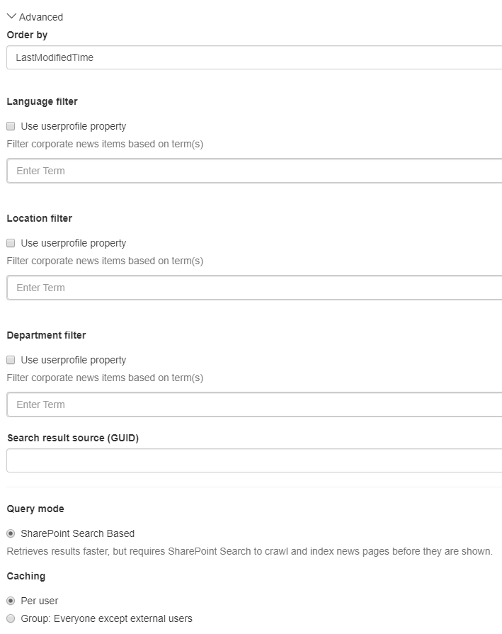
Remember to click ‘Save‘ to save any changes you have made.
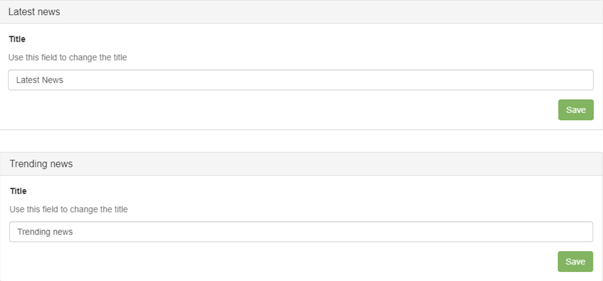
Configuring ‘Latest news’ and ‘Trending news’ sections:
The Latest news and Trending News sections allows you to change the titles shown in the app. Click ‘Save‘ to save any changes you have made.
Configuring the Noticeboard tab
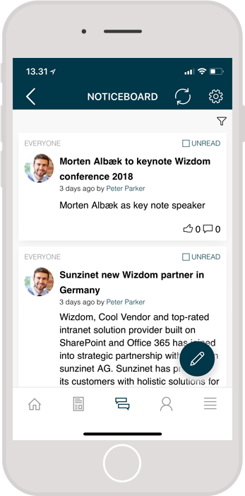
From the message tab, users can read, comment, react to, and write Noticeboard news.
The Noticeboard tab is configured in the Noticeboard area of the app administration.
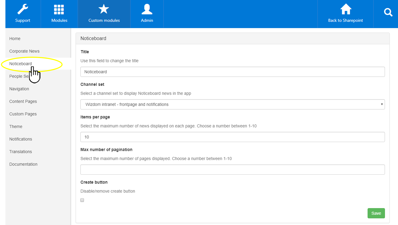
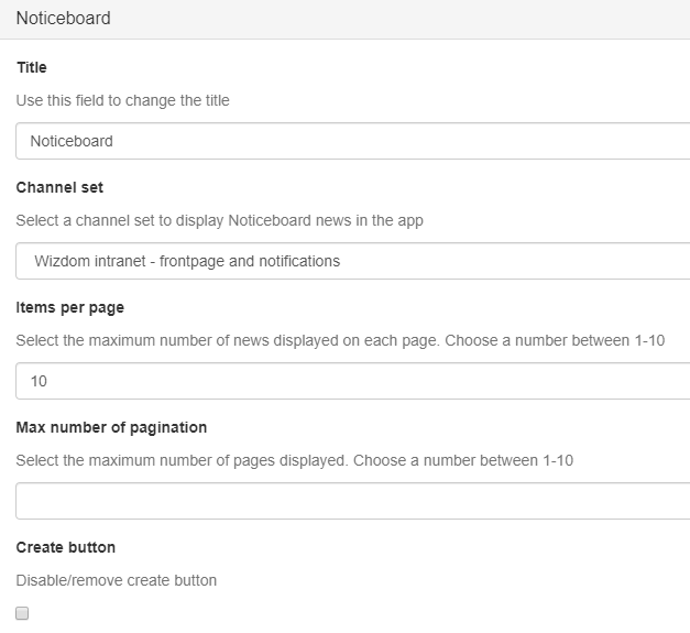
Fill in the fields to configure the Noticeboard section:
Title lets you enter a title for the section. If nothing is entered the default title “Noticeboard” will be applied.
Channel set lets you select among shared channel sets configured in Wizdom Configuration Center > Modules > Noticeboard > Channel sets. We recommend using the same shared channel set as used on your intranet main page.
Per default, news will be pushed to users with a push notification if the channel is set to mandatory read for the user in question. Users can change settings for push notifications.
Items per page lets you define how many items are displayed per page.
Max. number of paginations lets you define how many pages you want displayed. We recommend having around 3 pages.
Create button lets you hide the create button, if you do not want users to be able to create Noticeboard messages from the mobile app.
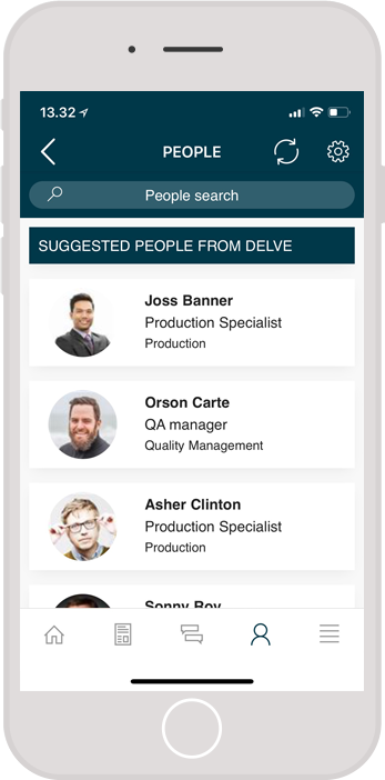
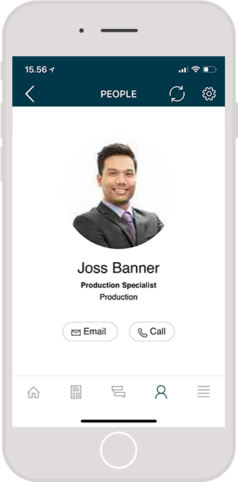
Configuring the People Search tab
The People Search tab allows users to search for colleagues and through Delve we display suggested people based on who you mostly together with. The People Search tab is configured in the People Search area of the app administration.
The People Search tab is configured in the People Search area of the app administration.
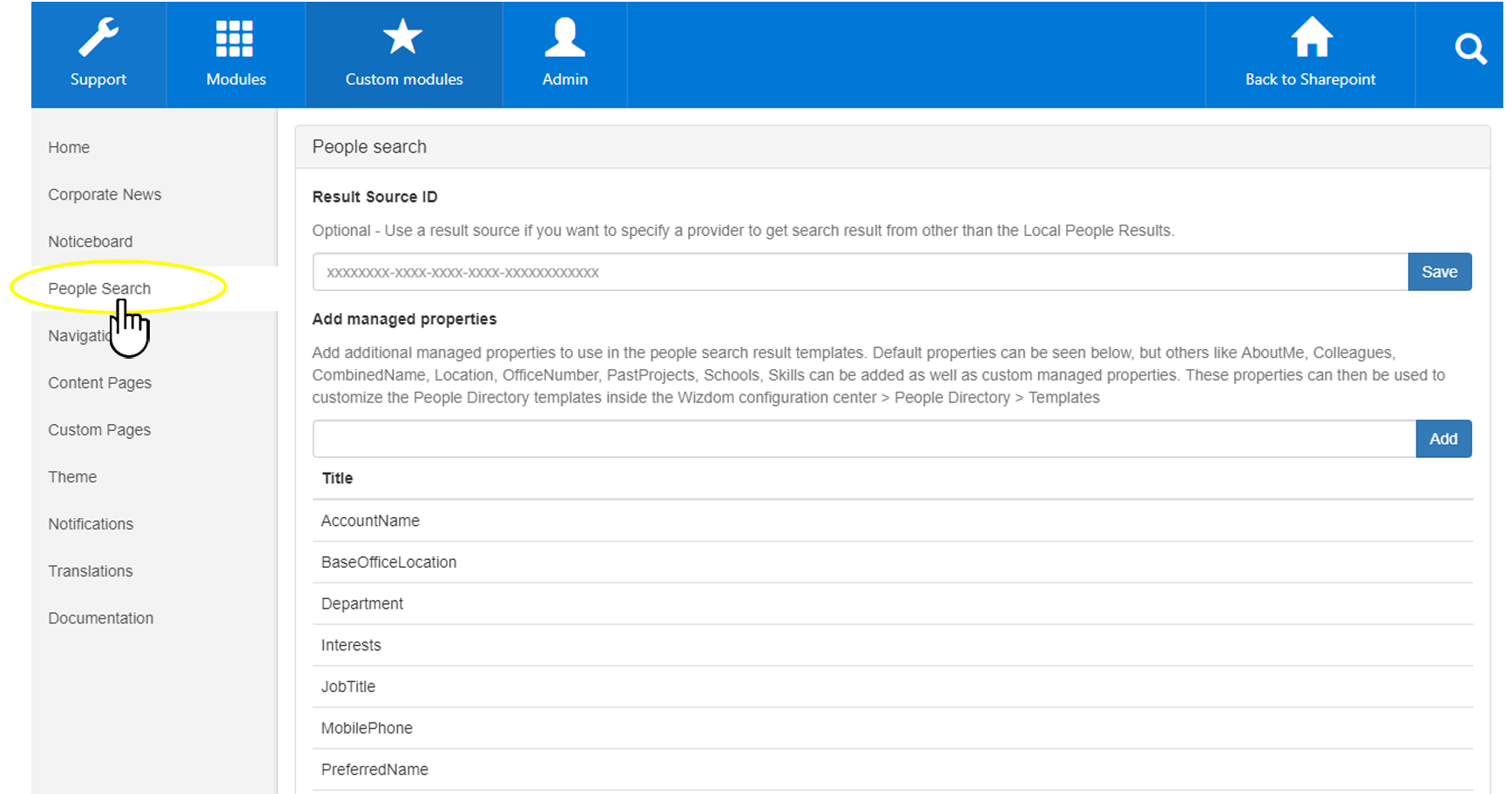
Fill out the fields to configure the People Search section:
Result Source ID lets you define a different SharePoint Search Result source to use when searching colleagues. This could be to remove guest users, service accounts, shared mailboxes etc.
Add managed properties allows you to add more details to each user. Please note that this also requires changes to the template being used. This can be changed in the Wizdom Configuration Center > People Directory > Templates.
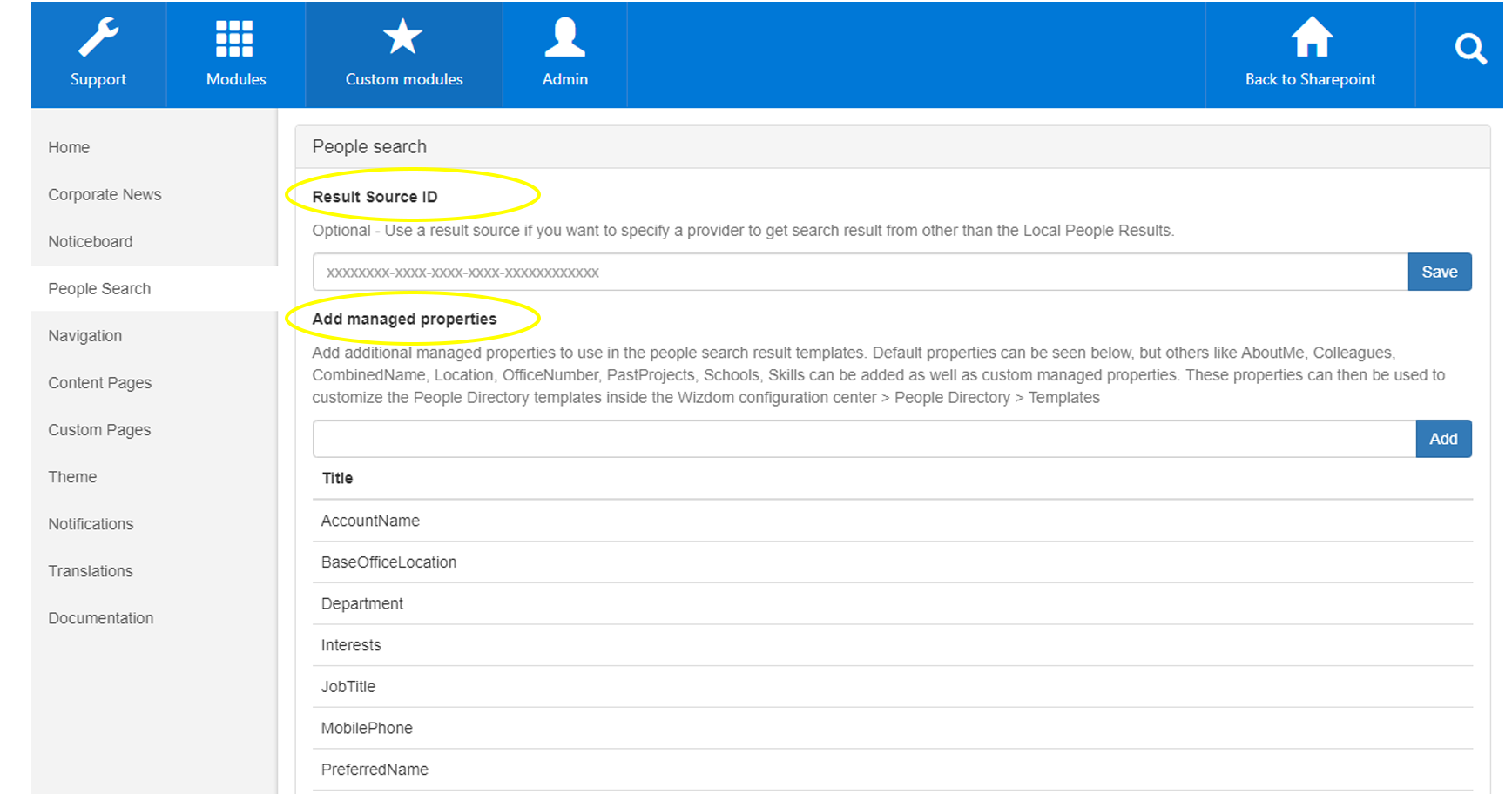
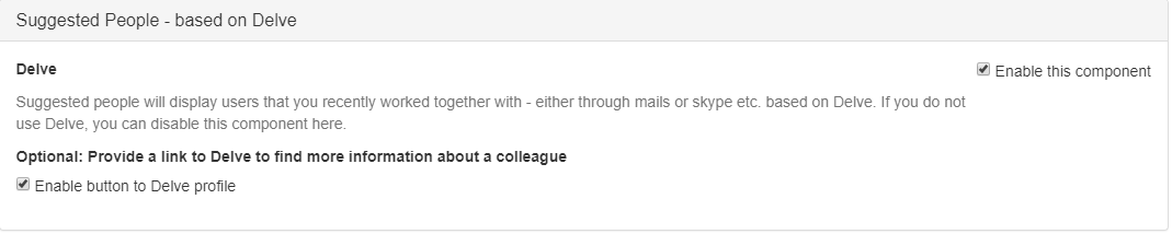
Suggested people based on Delve
Click Enable this component and Save to enable this component on the People Search tab. Optionally, you can also check Enable button to Delve profile to enable a button directly to the users Delve Profile from within the app.
The menu tab displays a menu unique for the mobile app. The menu is custom built in the mobile app’s module administration and lets you put the menu items that provide the most value for users in a mobile context.

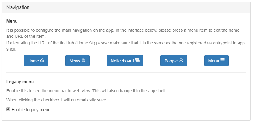
The Navigation tab is configured app administration and consists of two sections: Navigation and Menu Builder.
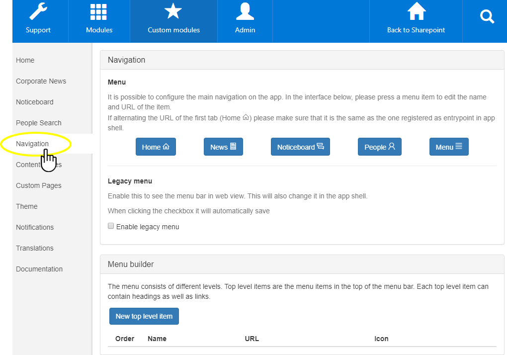
Navigation section
When the app is open, there is an icon menu at the bottom of the page. The menu tab consists of icons with URLs to the destination of your choice. The navigation section allows you to override the title and navigation URLs from the bottom navigation.
It is also possible to enable a legacy menu which will let you navigate within the app from a desktop browser. Please note that this menu will also be visible on mobile devices, so think twice before enabling this for troubleshooting or any other purposes.
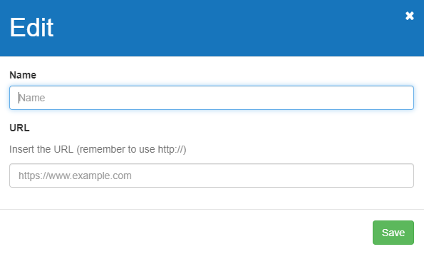
Press a menu item and fill in the dialog with name and URL:
Name is where you type the name of the menu item.
In URL, you insert the destination of the link.
Menu builder section
The menu builder section allows you to configure the navigation tab.
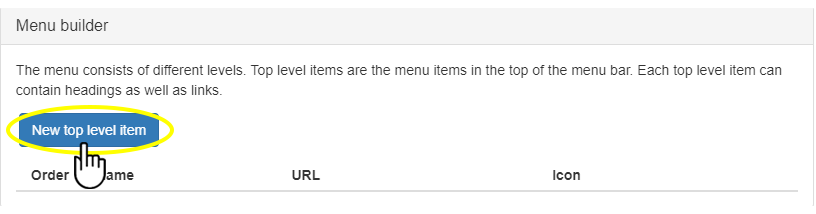
The menu is built upon different levels, and the top-level items, which contain headings and links, are displayed in the top of the menu bar. To add a top-level menu item press ‘New top-level item’.
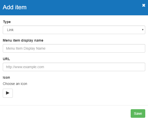
Next, fill in the dialog:
- Type lets you choose between Link and Header. Header will only be text; link includes a link.
- Menu item display name is where you type the name of the menu item.
- In URL, you insert the destination of the link.
- Icon lets you choose an icon for the menu item between a selection of icons. If you don’t want an icon for the menu item, press the play icon and select the white space.
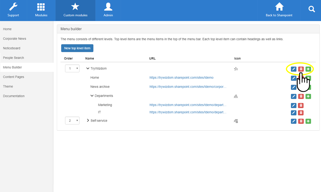
Once items are created, icons will be displayed to the right. Press the blue edit icon to edit a menu item, the red bin icon to delete a menu item, and the green plus icon to create a menu item under the current menu item. A maximum of three levels of menu items can be created.
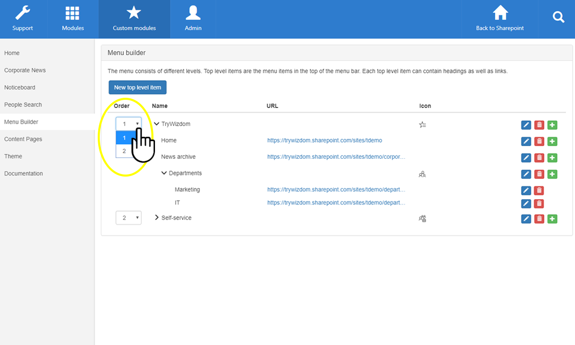
Use the selector under Order to change the order of the top level menu items.
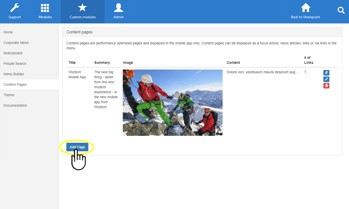
Configuring the Content Pages tab
In the Content Pages area you can create content pages to be displayed e.g. as focus article in the top of the home page of the mobile app. This gives you the freedom to feature any content you’d like in the app.
The mobile app is hosted in a separate application in Azure where also the content pages will be hosted. These pages will not be accessible from the web version of the intranet, only through the mobile app when they are e.g. linked to from the mobile menu or as focus article.
The link of a content page will look somewhat like this: internal://contentpageviewer({contentpageguid:’09cf4b4e-d688-4d53-a6b6-8b50cb695175′})

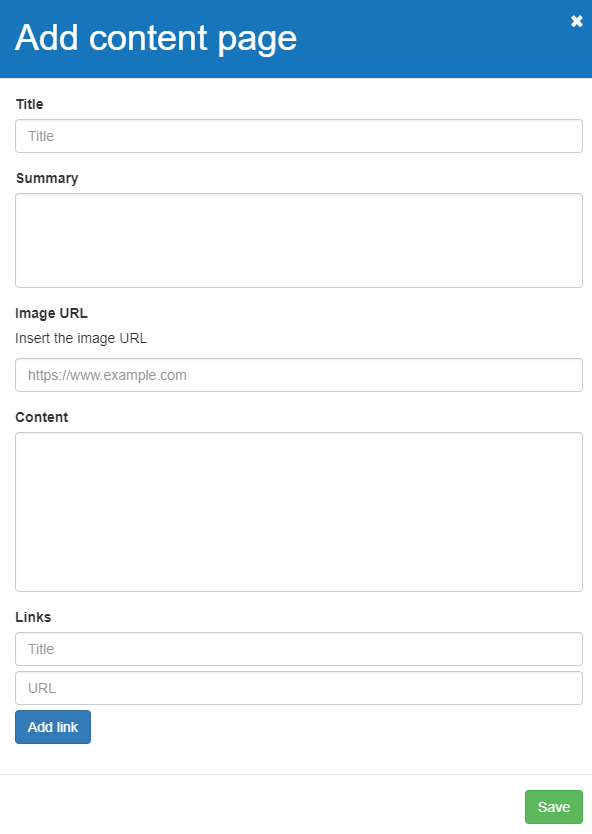
To create a new content page, click Add Page.
Next, fill in the dialog:
In Title, you insert the name of the page or article as you want it displayed for the users.
The text you write in Summary will be displayed just under the title.
Insert the URL of the image you want for the content page in Image URL. This image will be displayed as the background when the content page is featured in the top of the app’s home page, and it will be shown in the top of the full content page.
In Content, you insert the text of the page/article. Users will see this text when they click on the featured content in the top of the app’s home page and will be led to the full content page.
If you would like link(s) in the bottom of the content page, insert link title and URL in the fields under Links for each link you want on the content page.
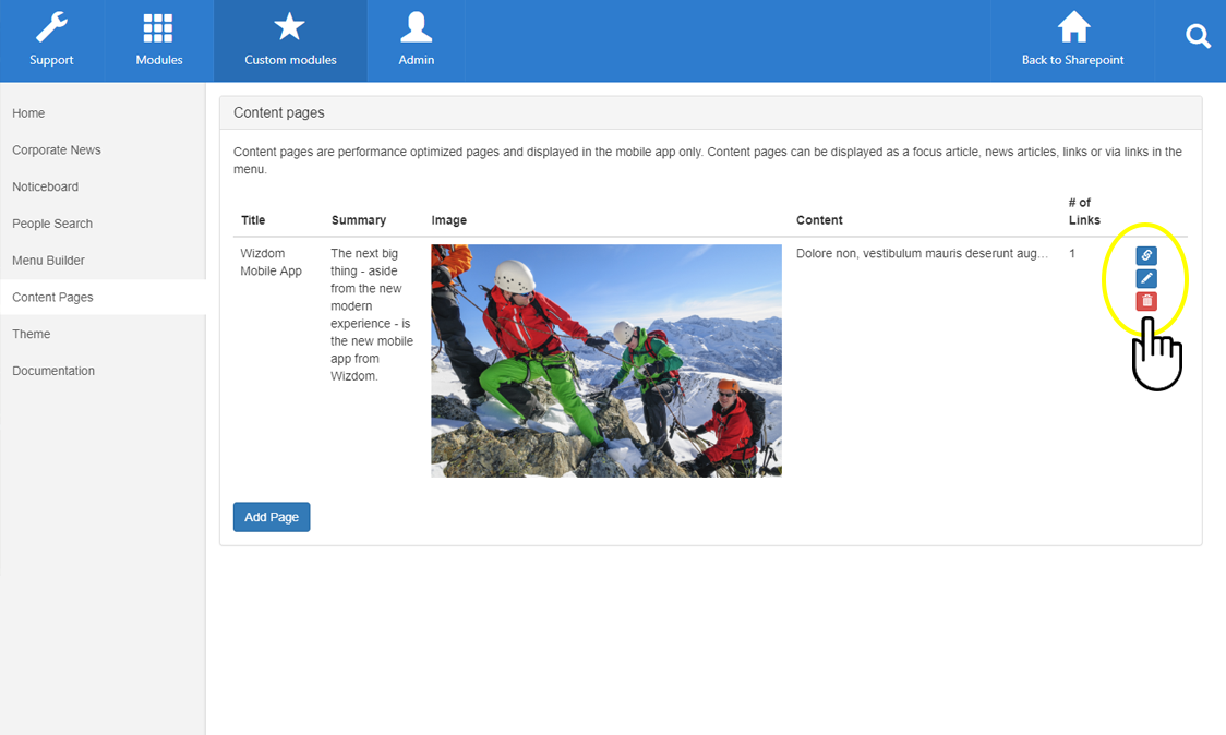
Press the link icon to copy the URL of the content page, press the edit icon to edit the content page, and press the bin icon to delete the content page.
Configuring the Theme tab
You can custom brand the mobile app with your preferred colors and fonts. This is done in the Theme area.
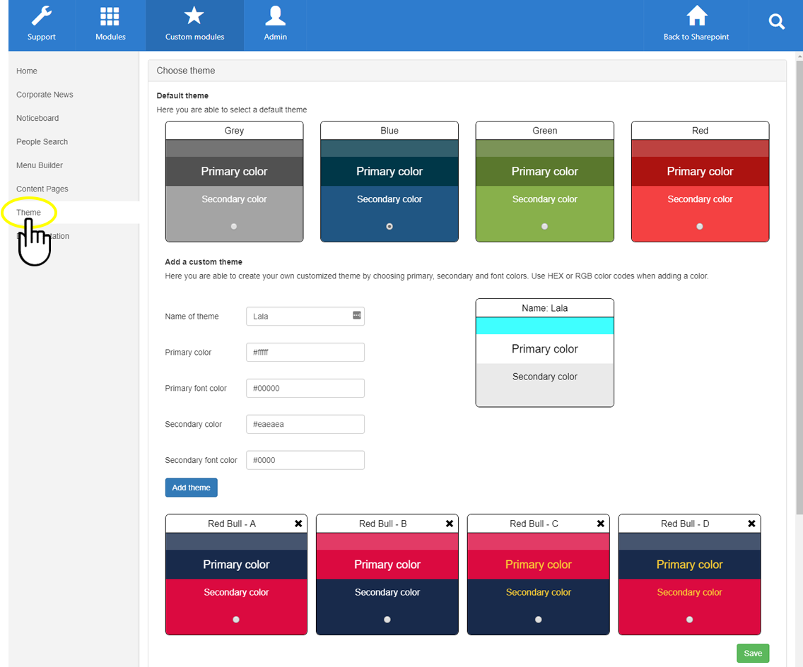
Default theme
You can choose one of the pre-configured color themes by selecting the radio button on you preferred theme.

Add custom theme
You can create your own theme with unique colors by filling out the color values under Add a custom theme.
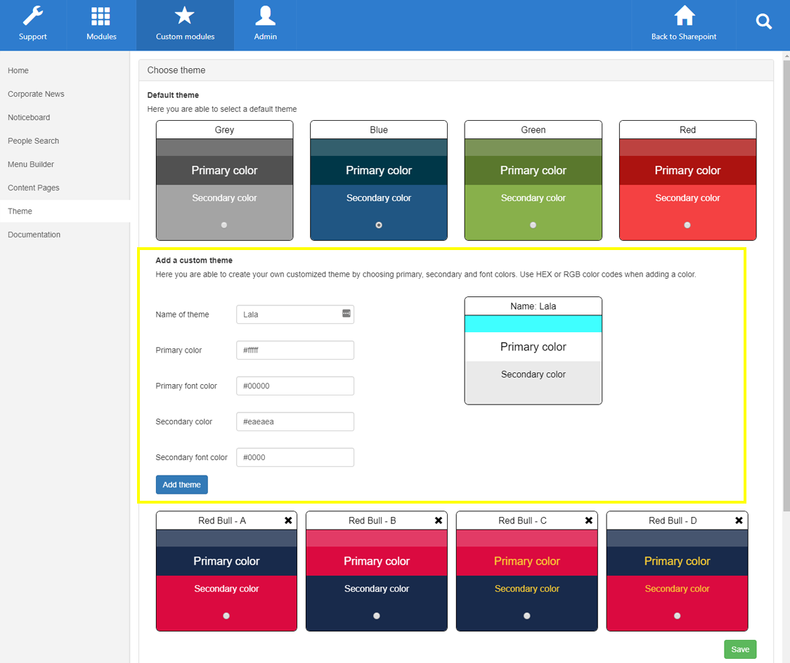
Your new theme will appear beneath the ‘Add a custom theme’ section where you can select it’s radio button to activate it on the app.

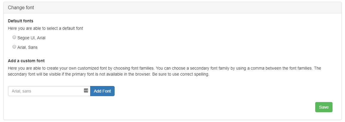
Change font
Scroll down to find the section where you can manage the font the app will use. Select one of the default fonts or add your own custom font.
Configuring the Notifications tab
The Notifications tab is used to define default push settings for Noticeboard and for editors to create push notifications for Corporate News.
The notification tab is configured in the Notification area in the Configuration Center.
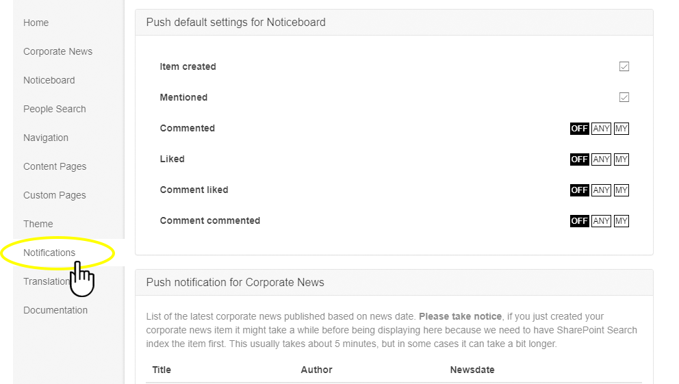
Push default settings for Noticeboard
For any user that has installed the mobile app, Noticeboard news will be pushed with a push notification if the user follows the news channel the Noticeboard news is published in – this means if the news channel is mandatory for the user, suggested and in the user’s news feed, or simply selected by the user. However, every user is able to override these settings with their own settings from within the mobile app.
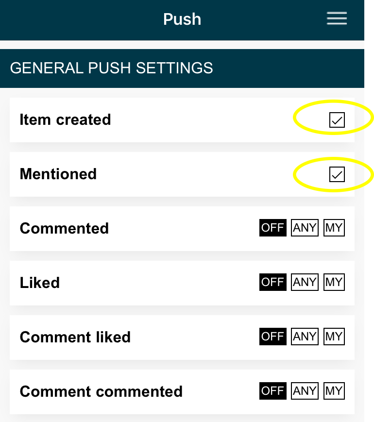
To change the general push settings within the app, press notification settings in the right corner.
We recommend having Item created and Mentioned enabled, and to let users decide whether or not they want to subscribe to other events. Tick the boxes to the right to enable these features.
You can control your notification settings by selecting either ‘Off‘, ‘Any‘, or ‘My‘.
‘Off’ will turn of all notifications triggered by comments.
‘Any’ will trigger notifications to you if any user comments a news in a channel that you follow.
‘My’ will trigger notifications to you if any user comments a news you have published.
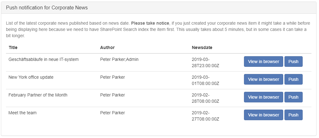
Push Notifications for Corporate News
This section allows you to see a list of the latest corporate news and click Push to create a Push Notification which is pushed to all users who has the mobile app installed. Click View in browser to preview the article. Editors must push Corporate News articles from the administration settings in order to create a notification.
Before being able to see a list of news articles you need to have the Corporate News tab configured, which can be done under the Corporate News tab of the Wizdom mobile app administration.
Please note the following before using this section:
- News articles needs to be indexed first before being displayed
- News articles are not security trimmed
- Every user will receive a push notification, unless they have disallowed notifications in general
- If friendly URLs is enabled for SharePoint navigation we cannot push a notification for the news article
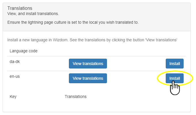
Installing translations
The translation tab allows you to install specific translation files related to the Wizdom Mobile App.
Find the language that you want to utilize in the list and click Install to install all translations needed. See translations by clicking View translations.