Mega Menu module settings
Configuring basic settings
Enabling the Mega Menu on your Wizdom installation and configuring basic settings is done from Wizdom Configuration Center. Here, you can set the mega menu to react on hover and configure the width of the menu.
The mega menu will replace SharePoint’s top navigation. If the mega menu is not enabled, the top navigation of your intranet will, therefore, be SharePoint’s global top navigation.
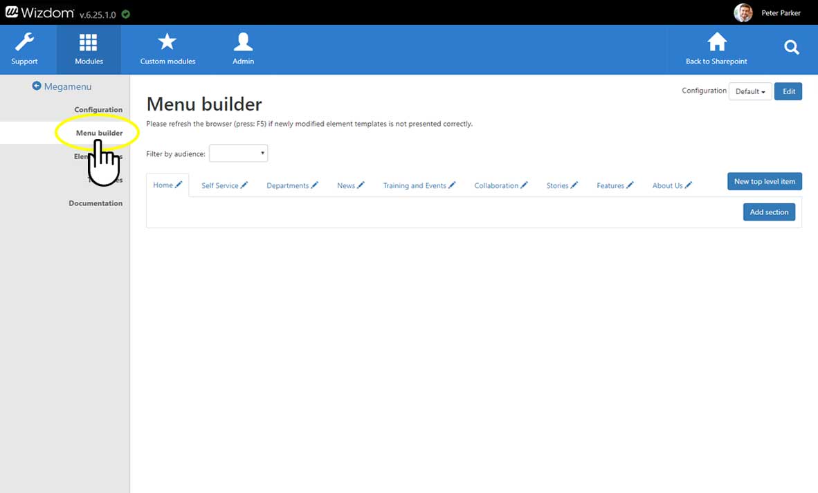
To configure basic settings of the Mega Menu module, go to the area, ‘Configuration’, in the Mega Menu module administration.
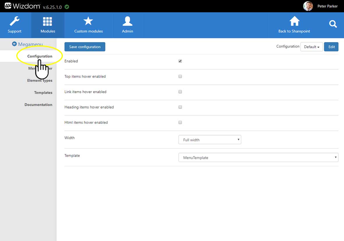
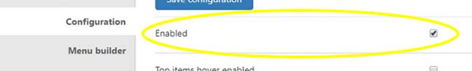
Ticking Enabled, will enable the Mega Menu on both modern and classic sites in SharePoint where Wizdom is installed. In both classic and modern it will replace the global navigation and on a modern site it will also replace the hub navigation on Hub sites.
Ticking Top items hover enabled, will add a hover effect on top items.
Ticking Link items hover enabled, will add a hover effect on items using the link element type.
Ticking Heading items hover enabled, will add a hover effect on items using the heading element type.
Ticking Richtext items hover enabled, will add a hover effect on elements using the Richtext element type.
Width will let you choose between a full width or adjusted width template. Full width will display the Mega Menu using the full width of the page, while adjusted width will adjust to the content inside the menu.
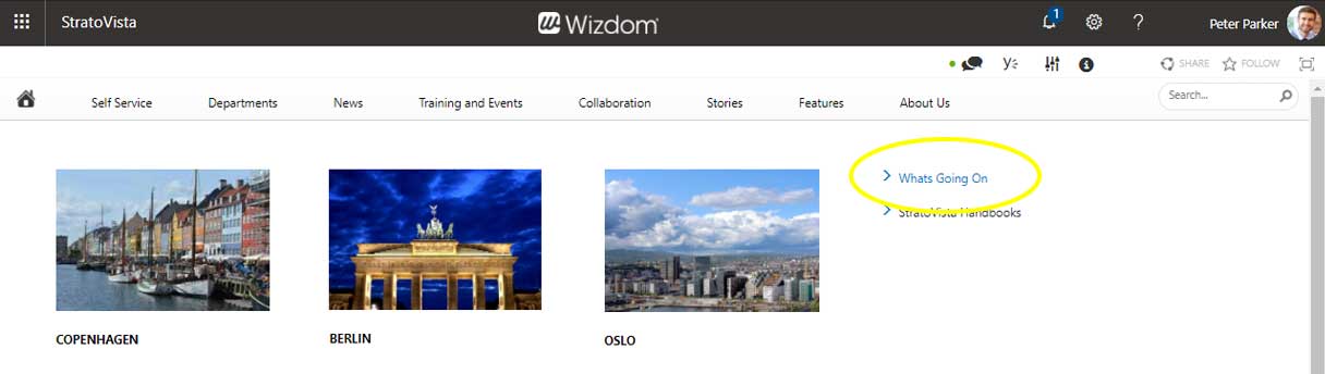
Full width mega menu
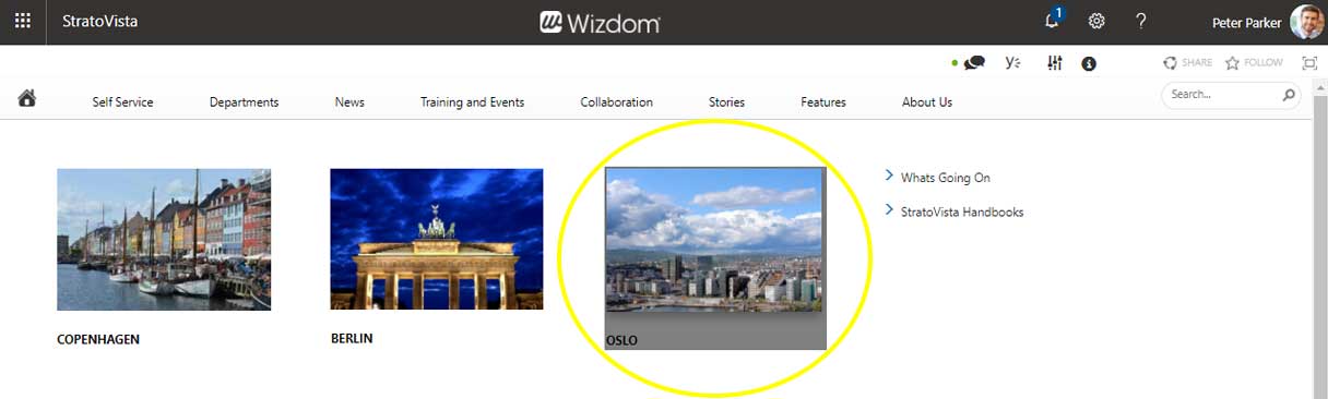
Mega menu with adjusted width
Template will let you change the template for the classic experience in SharePoint.
It’s the menu builder tool in the Mega Menu module administration that enables you to build your mega menu(s). This tool allows you to manage one or more menus for your organizations intranet.
To build your mega menu:
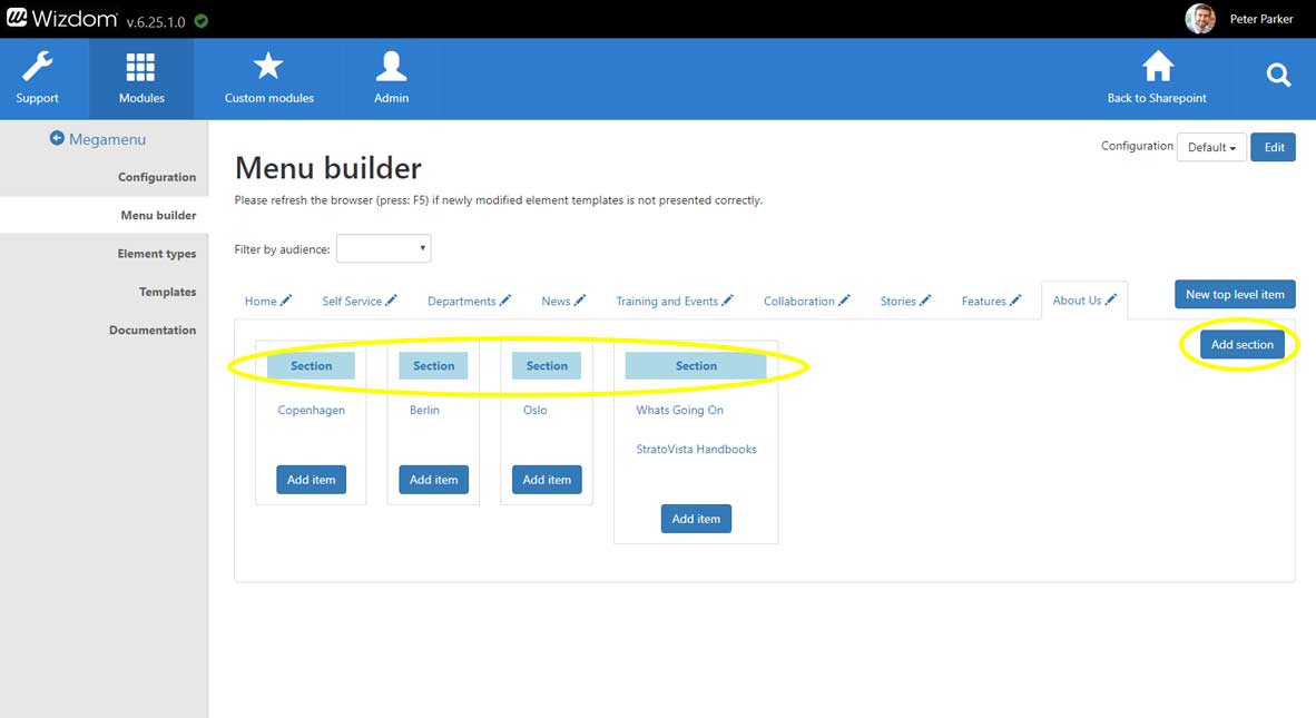
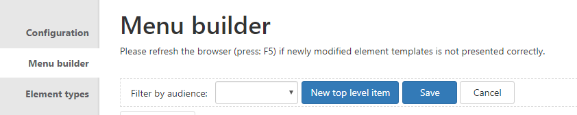
1) Go to the area, ‘Menu builder’, in the Mega Menu module administration.
2) You can choose to employ one global mega menu that spans across all site collections with the Wizdom app installed, or to introduce different mega menus for different site collections, subsites or groups of sites.
If you employ one global mega menu across site collections the mega menu will be the same on all site collections and subsites. If you employ more mega menus, you can display completely different menu content on different subsites, site collections, or groups of sites.
If you have multiple mega menus to manage, choose the site collection, subsite or group of sites you want to manage the mega menu for. This is done by selecting the site collection, subsite, or group of sites from the ‘Configuration’ selector tool. ‘Default’ is the menu for all site collection and sites that does not have a separate mega menu.
If you just work with one, global mega menu, just leave the value to Default.
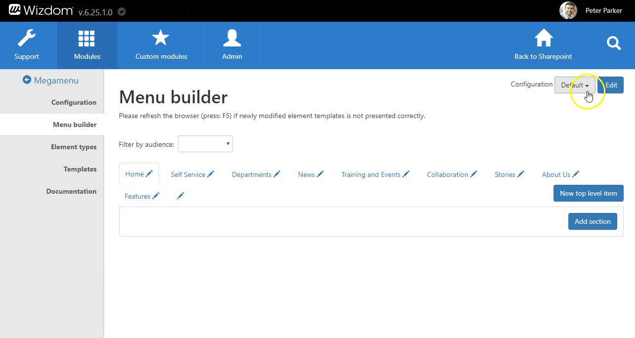
If you want to create a new mega menu for a site collection, subsite, or group of sites start by clicking the ‘Edit’ button next to the ‘Configuration’ selection tool. This will open a window that lets you enter the value of the site collection, subsite, or group of site you want to create a separate menu for.
The value you enter can be a full URL of a site collection, which will mean that the menu will be employed from this URL and below. However, it is parsed as a Regular Expression, so more open URL masks can also be defined:
E.g. ‘https://webtop.sharepoint.com/sites/Intranet/Projects’ will match the root of /sites/intranet/Projects and every URL below.
If you instead enter ‘Projects’ it will match the same as above, but will also match URLs like https://webtop1.sharepoint.com/sites/Projects, https://webtop1.sharepoint.com/sites/Intranet/pages/Projects.aspx, etc. In this way, you can create a mega menu specifically for all sites that has ‘Projects’ as part of the URL.
You can use a regex tester and test wheter a string matches the expression’s pattern. We recommend the following external resrources: http://regexstorm.net/tester and https://regex101.com/ .
After you have added the value for the site collection, subsite, or groups of sites, you can choose the approproate from the ‘Configuration’ selector and begin to build a mega menu specificly designed for this.
3) After selecting the appropriate site collection, subsite or groups of sites, you can start building or editing menu content by pressing the menu’s edit button.
When editing the mega menu, it will be checked out to you and, as long as you work on it, no one else will be able to edit it.

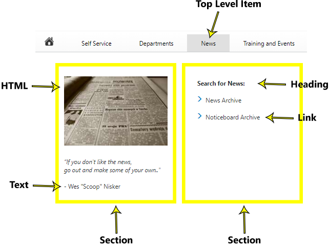
The menu consists of different levels and types of content:
Top level items are the menu items in the top of the menu bar. Under each top level item, the mega menu will fold out with its content. The content of the mega menu is divided into sections. These sections are columns that can contain links as well as headings, text, and HTML elements.
Each type of content has a different styling determined by the element type templates. In this way, you can build and design your menu using a combination of these elements.
4) To configure top level items, click ‘New top level item’ to create a new, or click on an established top level item to edit it.
NOTE: Best practice is to keep to fewer than 10 top level item links for all user groups. If more are employed, in most cases (depending on screen size), the screen will change to responsive mode even on PC’s and the Mega Menu will change to the responsive burger menu.

5) To configure sections of the mega menu:
a) Click in the area of the top level item you want the content to be located under. This will present you to an overview of sections and content – if any – created under the top level item. Click ‘Add section’ to create a new column to hold the menu content, or click on an established section to edit it.
b) When editing a section or creating a new, a window lets you select one or more group(s) as audience for the section. Only this group of users will be able to see content of this section in the mega menu. If the field is left blank, the section will be visible for all users.

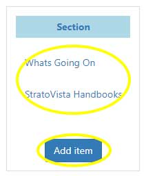
6) To configure content of the mega menu, click ‘Add item’ to create a new item in the mega menu or click on an established item to edit it.
Creating and editing content and top level items in the Mega Menu, a window lets you define properties of the content/item. The selection of fields to fill out change depending on the type of the element you are creating. Here, we will go through the fields you can meet in these windows:
Type lets you choose between the element types, link, text, HTML, heading, and top item.
NOTE: The ‘Top item’ is a legacy element that is conserved in order for the legacy template ‘MenuTemplateDesktop’ to function properly. Dispite its name, this element type is not necessarily used for the top level item that can e.g. conveniantly be appointed a link or heading type.
Text is the text for the item, users see in the menu.
In URL you type the URL of the location, you want the item to link to. If you don’t want the item to link, you simply leave the field blank.
Ticking Open in new window, will open the location of the URL in a new window.
The Language field enables you to create a multilingual menu by defining unique content for each language you want the item to appear in. Read more about making menu items available in more languages by using the language field.
If you don’t need your menu in multible languages, simply leave the field with the default value ‘All’.
Audiences lets you select one or more group(s) as audience for the item. Only this group of users will be able to see this item in the mega menu. If the field is left blank, the item will be visible for all users. Read more about targeting menu content to different user groups.
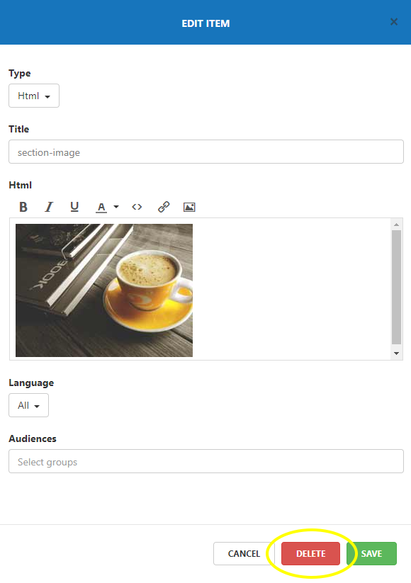
For an HTML element, Title allows you to create a unique name for the HTML element in the menu builder, labeling the element for easy identification by menu administrators.
The HTML field, also for the HTML element, offers content editing like text formatting and media inserting/editing tools.
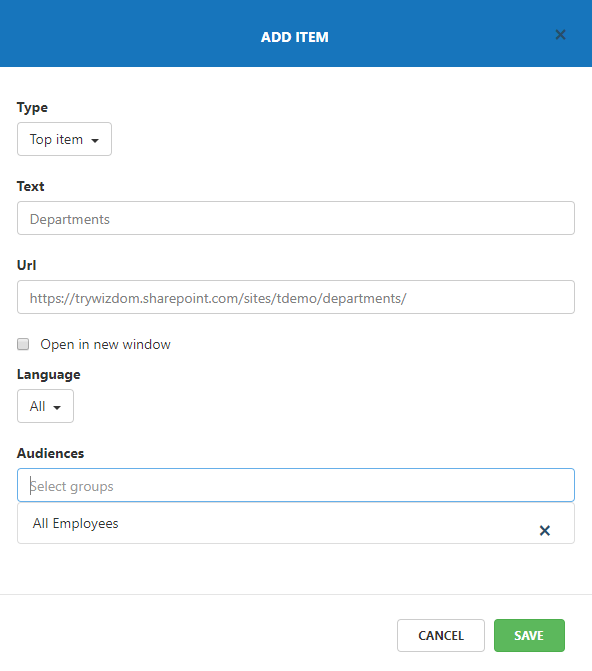
Example of window for creating/editing a top level item
After you have created the content of your mega menu, you can move and reorganize items by dragging and dropping them.
To delete content of the mega menu, simply click on the item or section you want to delete. This will open the edit window where you will find the ‘Delete’ button.
7) When you’re done editing the mega menu, you press ‘Save’ to save your changes.
The ‘Cancel’ button gives you a way out if you regret the changes you have made to the menu. After pressing ‘Cancel’, your changes to the menu will be discarded.
Please note that the Mega Menu items are static and they are not automatically security trimmed. Also, elements displayed in the Mega Menu will differ from what is displayed in the mobile navigation. This happens because the mobile navigation only supports displaying regular links and headings.
Targeting menu content
Often, disparate content is relevant for different user groups. E.g. HR employees might need to access other content about HR than employees engaged in other job functions.
The mega menu supports this by allowing you to create menus customized to different audiences.
In this way, users are only presented to links that are relevant for their job function.
NOTE: Links in the mega menu will not be security trimmed. This means, that if no permissions has been set on site basis, all users will still be able to find content on this site e.g. by the means of search.
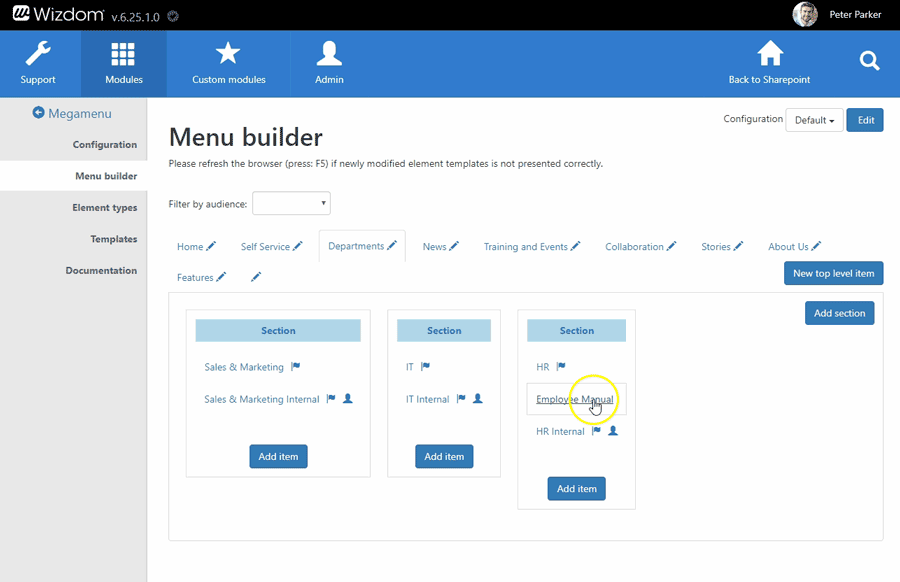
Targeting menu content to different user groups is done from the mega menu module’s menu builder.
1) The mega menu works with user groups defined in AD. When you have an overview of the user groups in your organization and which content they need to see in the mega menu, start building a menu that adapt to these needs. This is done by setting an audience for each item in the menu.
In most cases, some items will be common for all user groups while other items are targeted. E.g. you might have certain content on your intranet that is only allowed to see for IT or top management. Or you have content that is only relevant for certain employee groups like a collaboration page for the HR team.
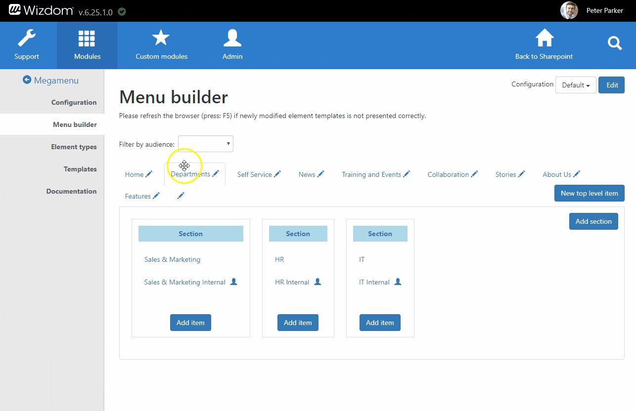
When you have set an audience for a menu item, a profile icon will appear next to it.
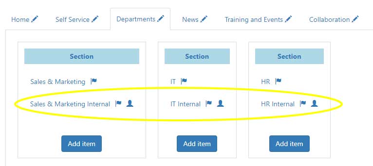
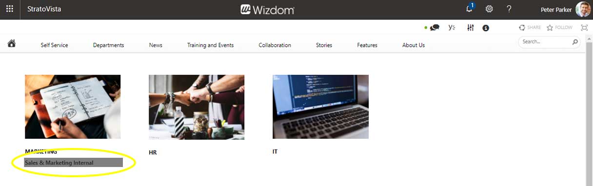
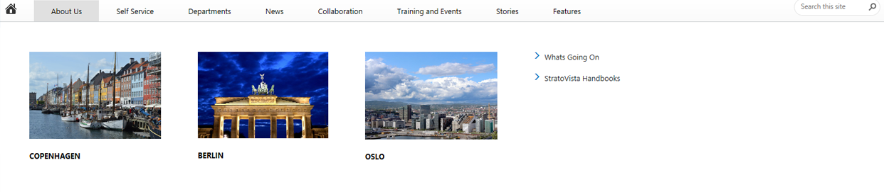
Example of a menu that will adjust its content to the role of the user. IT, marketing, and HR staff will see the link to the internal page for their respective work area. Other users will not. The items that are audience-targeted are marked with a profile icon.
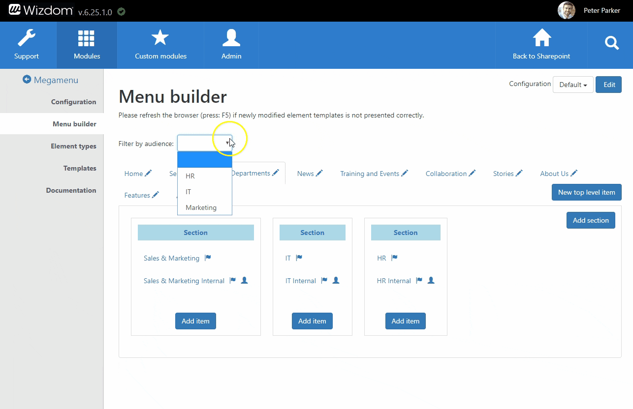
2) To get a clear overview of the mega menu items, each user group will see, you can filter the menu by audience. From ‘Filter by audience’ in top of the menu builder, select the different user groups by turn to see the items of the menu that will be visible to this audience.
The filter only lets you select between the user groups you have already targeted items to.
Language is not managed by user groups, but by creating content for the same menu item for different languages by the means of the ‘Language’ function.
A built-in language engine enables the Mega Menu module to support navigation on a multilingual intranet.
Enabling menu content to appear in multiple languages is done from the mega menu’s menu builder.
For the menu items, link, text, heading, top item, and HTML, you define a unique link and title for each language your want the item to appear in.
NOTE: Every language, you want to employ in the Mega Menu, has to be enabled in the ‘Languages’ module.
To translate a menu item into more languages perform the following steps:
1) From the menu builder in the Mega Menu module administration, click on the item you want to make available in more languages. This will open the edit window.
2) From the Language field, select the languages, you want to translate the item into, by turn, and enter the appropriate content for each language. For every language, you can fill in a unique value in every field. The only thing that you can’t change and that will stay the same for all languages, is the structural placement of the item in the mega menu. However, you can choose to only fill in a unique value in e.g. the text field. In this way, only the language of the link and not the URL will vary depending on the language.
The content of the default value ‘All’ is shown to users when the the site is not set up to display a language, that the user has in his or her language settings, or when the user’s settings for language does not correspond to any of the languages configured in the menu item.
NOTE: In the edit window, you will only see content for the language you are editing. Also, every time you have entered values for a language your changes will be autosaved and you can continue entering content for a new language. However, after you have entered content for all relevant languages, you will have to save all changes you have made by clicking ‘Save’ in the edit window. Otherwise, all changes will be lost.
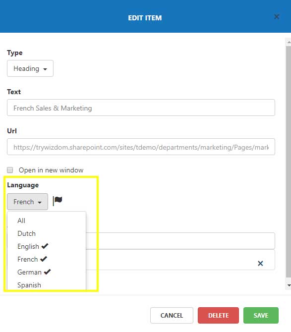
As an example of making a menu item available in several languages, you might have a menu item linking to an employee manual. This employee manual might be available in French, German, and English to meet the language skills of employees in your international organization.
In order for the French, German, and English speaking employees to be exposed to a link title in, respectively, French, German, and English, and to a link that points to the employee manual in, respectively, French, German, and English, by turn, you enter the French, English, and German word for employee manual in the text field and the link to, respectively, the French, English, and German employee manual in the URL field.
This will make French speaking users see the link text ‘manuel de l’employé’ that will link to the Employee manual in French, German speaking users see the link text ‘Mitarbeiterhandbuch’ that will lead to the employee manunal in German, and so on.
When an item is available in more than one language, a flag icon will appear next to it.
The language, the user sees, is determined by a couple of factors:
1) The languages enabled for the site. A language has to be enabled at the top level site before the mega menu is able to show the user content in this language.
2) The display language set in the user’s SharePoint profile. If possible (if the language is enabled at the top level site and content is added to the mega menu for this language), the mega menu will show content in the language that has the first priority of the user, if not, the mega menu will show content in the language that has the user’s second priority etc.
3) If the user has not set a preferred language in his or her SharePoint profile, that the mega menu is able to display, then the user’s browser settings for language will determine the language of the mega menu items.
4) If the mega menu is not able to display any of the display languages set in the user’s SharePoint profile or the language set in the browser, the user will see the menu content entered for ‘All’ under the ‘Language’ field.
From the area ‘Element types’ in the mega menu module administration, you get an overview of the mega menu’s different types of elements.
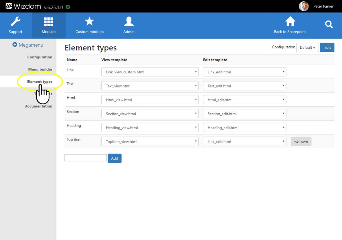
You can define and configure these different types of elements by the means of templates.
Every element type has two templates. One that controls the way the element behave when users view it in the mega menu, the ‘View template’, and one that defines the edit window where mega menu administrators establish content of the element type, the ‘Edit template’.
Per default, every type of element is connected to an appropriate template. Therefore, if you don’t want to change the style and behavior of the elements in your mega menu you don’t have to do a thing.
NOTE: The ‘Top item’ is a legacy element that is conserved in order for the legacy template ‘MenuTemplateDesktop’ to function properly. Dispite its name, this element type is not necessarily used for the top level item that can e.g. conveniantly be appointed a link or heading type.
In case you have created custom templates for one ore more element types to change the style and behavior of these , you can connect the elements to the custom templates by selecting the appropriate view and edit templates for the element(s).
If the built-in element types (link, text, HTML, heading etc.) isn’t sufficient, you can create new.
1) Type the name of the new element type in the field below the established element types, and click ‘Add’.
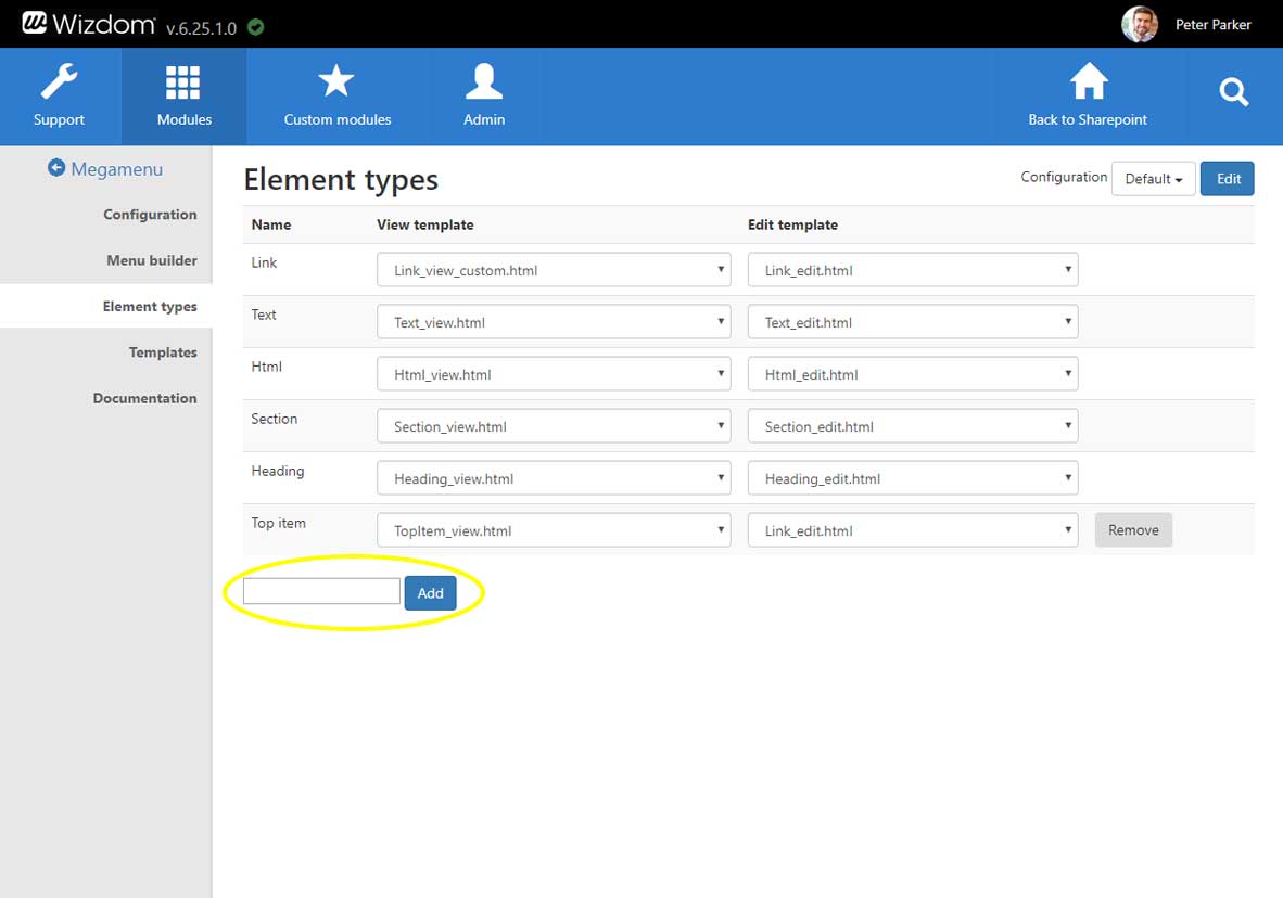
2) A ‘View’ and an ‘Edit’ template is automatically created for and connected to the new element type. In these templates, you can custom style the element type.
NOTE: When updates are introduced to the mega menu module, customized element types will might not receive these updates.
You can remove custom element types and the ‘Top item’ element type by pressing the ‘Remove’ button next to the element type.
The predefined element types, Link, Text, HTML, Section, and Heading, can’t be deleted.
The Wizdom template mechanism enables you to customize the look, feel, and functionality of the Mega Menu module by the means of templates.
The Mega Menu module includes two templates for the menu:
1) The template ‘MenuTemplate’ which is the recommended template because it benefits from all features of the module.
2) The template ‘MenuTemplateDesktop’ which is a legacy template for menus created before Wizdom version 6.10. This template does not supports the Heading and Text item.
Also, the mega menu includes templates for the menu items and the windows to edit these.
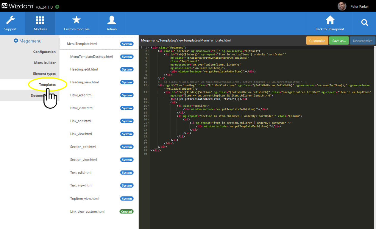
You find an overview of templates for the Mega Menu module under ‘Templates’ in the Mega Menu module administration. From here, you can edit existing templates and create new.