Interactive Canvas module settings
Search for Interactive Canvas in the Configuration Center to change the settings and customize your Interactive Canvas module.
Configuring Tiles
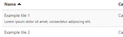
The tiles created and edited in the Tile overview page. All tiles are present in this page with their name, description, categories, owner, type, and tile size.
If a tile is either disabled or has a target audience, then this will be shown by a label next to the name of the tile.
1) Click on Tile overview to create or edit your tiles.
3) Edit and customize Tiles with pre-made templates.
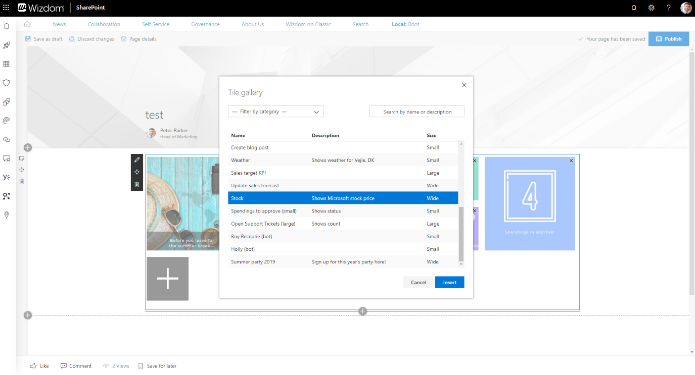
2) Once your Tiles have been configured in the Configuration Center, they are shown in the Tile gallery which you can access from the page editor.
To create a new tile, simply press Create and form a tile according to your preferences entering name, type, and audience. With the option to specify audiences, you can limit access to the content presented in the Interactive Canvas.
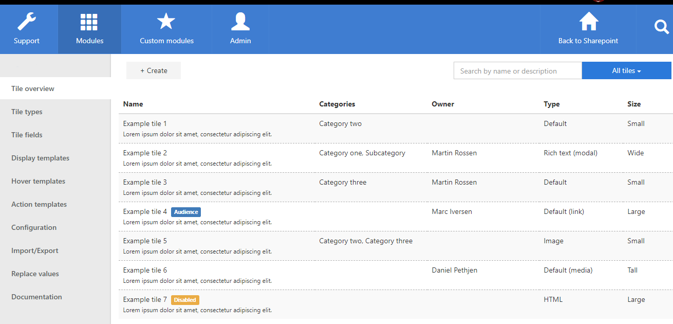
By clicking on a row in the tile overview, the tile can be edited to different field values. It is also possible to delete the tile entirely or disable the tile which will prevent it from showing up in the Interactive Canvas gallery as well as in any web parts.
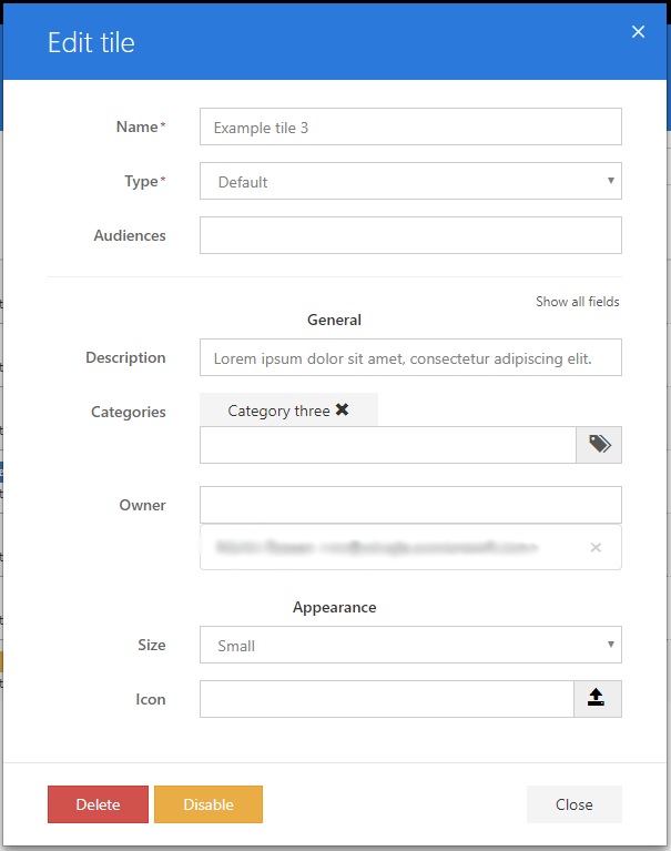
In the Edit tile dialog there is an option to show more advanced fields which are related to the appearance of the tile. By clicking the Show all fields text, fields for setting CSS classes, background color, and font color will become visible. Edit appearances by choosing tile size and icons.
Filtering the overview
To find a specific tile, different filtering options are possible. These options include sorting columns, selecting a specific category, filtering by tiles the current user owns, or have recently edited and searching by tile name or description.
Your content goes here. Edit or remove this text inline or in the module Content settings. You can also style every aspect of this content in the module Design settings and even apply custom CSS to this text in the module Advanced settings.
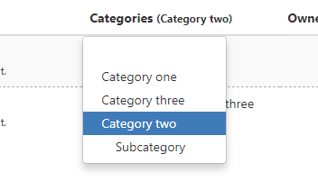
To show only tiles from a specific category, click the Categories header and select the category.
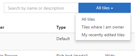
To view only tiles where the logged in user is set as owner, select this from the dropdown in the top right corner of the tile overview. From here it is also possible to select the option of only viewing tiles where the logged in user is the last editor.
To filter by searching in the tile names and descriptions, type in the input field in the top right corner.
Interactive Canvas gallery
Once tiles have been created in the Configuration Center, intranet administrators can design the Interactive Canvas according to preferences and goals by choosing tiles from the Tile gallery.
Configuring Tile types
Tile types decide the characteristics of a tile and can be configured and created by pressing Tile types in the left menu bar. Once the collection of types is created, you can design your tiles based on the specific type options.
The Interactive Canvas module comes with the following default types as well as the option to create custom types. As different tile types come with various features and functions, you can choose types depending on purpose and area of use.
|
Type |
Description |
Examples of use |
|
Default |
A tile with an optional icon that displays the description text on hover. |
Short messages of information. |
|
Default (link) |
A tile with an optional icon that redirects to either an internal or external link when the user clicks the tile. |
Alternative to other link functionalities such as the Mega Menu, Service Menu and Quicklinks modules. |
|
Default (media) |
A tile with an optional icon that opens a media file (image, video, audio) or an iframe when the user clicks the tile.
The Media URL needs to be a direct link to the media file (e.g. .png or .mp4). |
To show media files or iframes without redirecting the user to another page. |
|
Image |
A tile that displays an image and opens the image in a larger modal view when the user clicks the tile. |
To show images without redirecting the user to another page. |
|
Image (link) |
A tile that displays an image and redirects to either an internal or external link when the user clicks the tile. |
Alternative to other link functionalities such as the Mega Menu, Service Menu and Quicklinks modules. |
|
Rich text |
A rich text editor-based tile. The display content is shown in the tile when the user does not hover. When the user hovers the tile, the content defined for hover will become visible. |
Alternative to the Default type, but with a rich text editor. |
|
Rich text (modal) |
A rich text editor-based tile. The display content is shown on the tile when the user does not hover. When the user clicks the tile, the action content will be presented in a modal dialog.
|
Longer information messages. |
|
HTML |
The HTML tile will render the html (supports angularjs) it is provided. The display content is shown on the tile when the user does not hover. When the user hovers the tile, the hover content will become visible. |
More complex requirements that cannot be solved by using the Rich text type.
Typically requires some developer skills. |
|
HTML (modal) |
The HTML tile will render the html (supports angularjs) it is provided. The display content is shown on the tile when the user does not hover. When the user clicks the tile, the action content will be presented in a modal dialog. |
More complex requirements that cannot be solved by using the Rich text (modal) type.
Typically requires some developer skills. |
The collection of tile types can be configured in the Tile types page. This page is only available to users in the Interactive Canvas admin group.
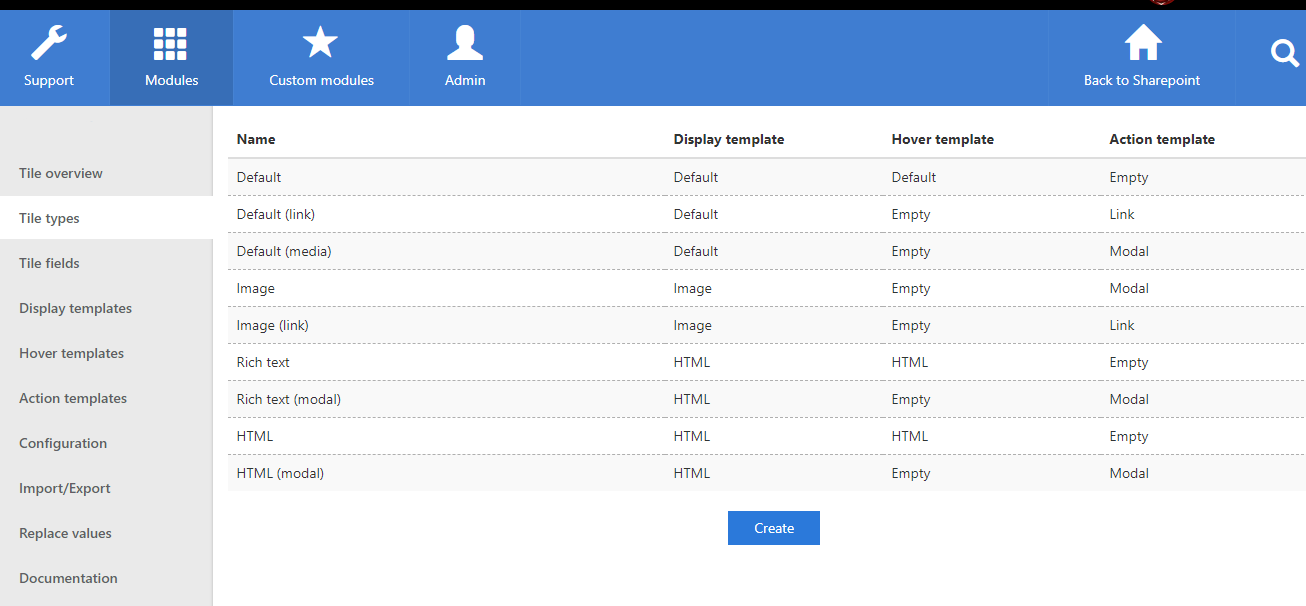
By clicking on a row in the type overview, the type can be edited to have a different name, combination of templates, or non-base fields. The existing values in already created tiles will not be affected by changing the type non-base fields but will be updated once the tile is edited.
To create a new type, click the Create button at the bottom of the page. Enter name followed by choosing template settings regarding Display, Hover, and Action. If you to exclude a function from the type, select Empty in the drop down menu with templates.
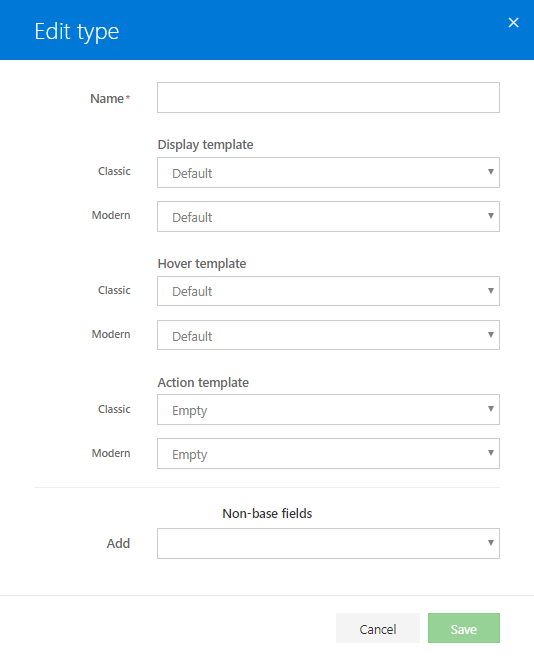
The Non-base fields allows you to add you meta data fields that you can use and consume data from in your template, which will help create generic configurable packages.
Configuring Tile fields
Tile fields allow intranet administrators to add additional information to a tile, stored as meta data. Fields can belong to several categories; General, Appearance, Link, Image, and Other.
The tile fields can be configured in the Tile fields page and can then be referenced to from the different templates when configuring tile types. This page is only available to users in the Interactive Canvas admin group.
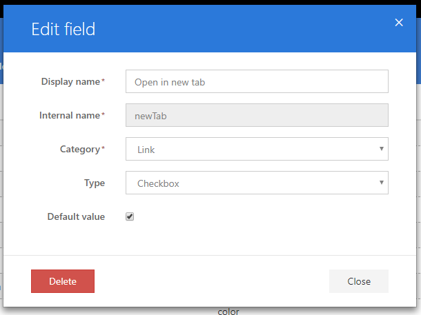
The Name/Display name value is used in the form when creating new or editing existing tiles and the Key/Internal name value is used when accessing the data from the templates.
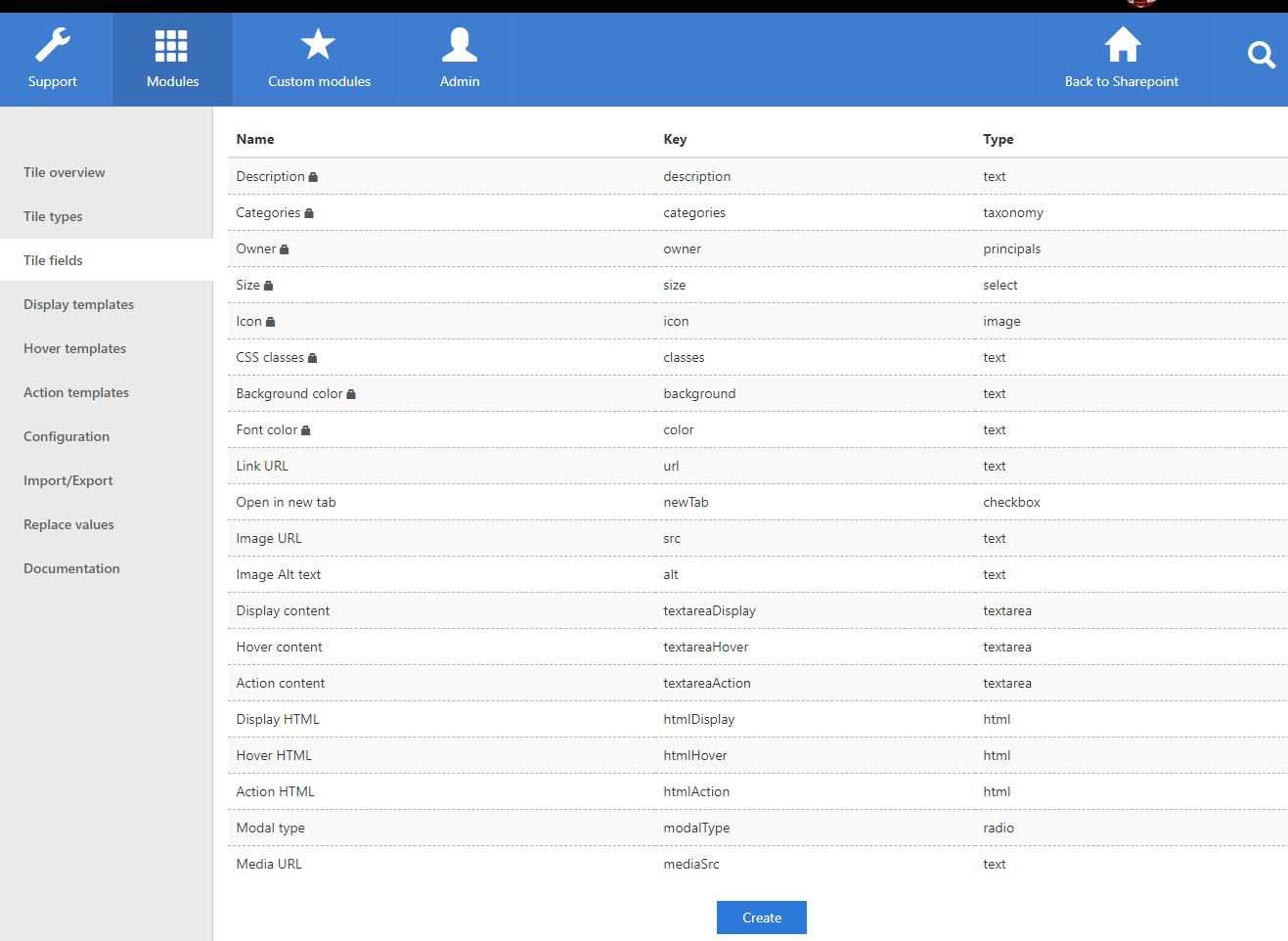
By clicking on a row in the field overview, the field can be edited to have another display name, category, type, or default value. The existing values in already created tiles will not be affected by saving the field changes but will be updated once the tile is edited. Editing base fields (indicated by a lock icon in the overview) is not possible.
To create a new field, click the Create button at the bottom of the page.
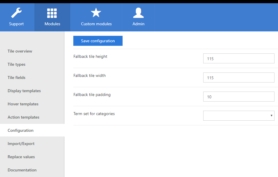
Module wide configuration
The module wide settings can be found in the Configuration page. This page is only available to users in the Interactive Canvas admin group. The page contains the following four settings:
- Fallback tile height
The height in pixels used for tiles if the web part does not specify one. - Fallback tile width
The width in pixels or percentage used for tiles if the web part does not specify one. Values between 0 and 1 will be treated as percentages, values above will be treated as pixels. - Fallback tile padding
The padding in pixels used for tiles if the web part does not specify one. - Term set for categories
The term set used for setting categories when creating or editing tiles.
Configuring templates for classic pages
Templates define characteristics of a tile and its functions. The template configuration is performed in three pages: Display templates, Hover templates, and Action templates. Templates created in these pages can be selected when creating new tile types, which can contain a display template, a hover template, and an action template.
Display templates decide the appearance and presentation of the tile.
Hover templates allow a hover to show when moving over the tiles.
Action templates determine what happens when you click on the tile.
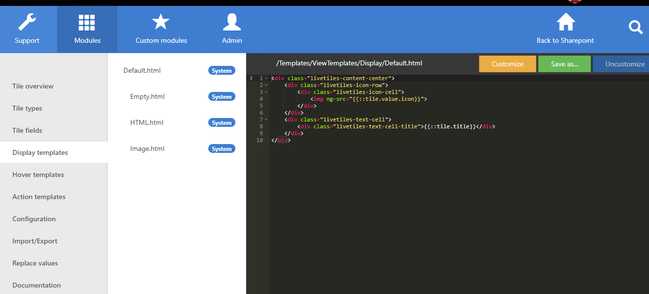
Templates show up in a drop-down list when new tile types are created. You can customize templates through HTML codes and save the new version alongside the pre-made ones.
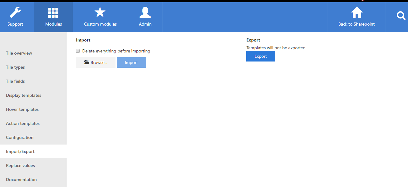
Importing and exporting Interactive Canvas data
Importing and exporting the fields, types, and tiles is possible from the Import/Export page. This page is only available to users in the Interactive Canvas admin group.
To export click the Export button which will start the download of an export file in the json format. Templates are not included in this export as this is possible from the Import/Export module in the Admin tab.
To import first click the Browse button and select the json file. If the file was successfully parsed, then the Import button will become clickable. If the ‘Delete everything before importing’ option is selected, then the entire Interactive Canvas dataset will be replaced by the content of the import file.
Importing large files can take minutes to complete.
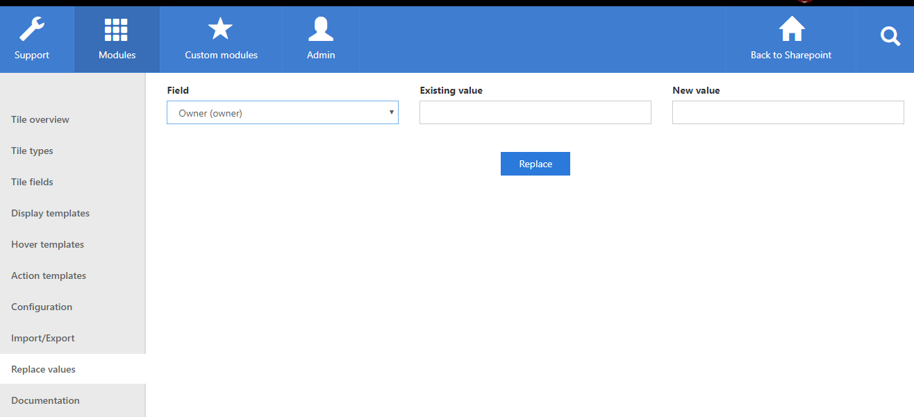
Replacing field values across tiles
To replace existing values across all tiles the Replace values page can be used. This page is only available to users in the Interactive Canvas admin group.
First select the field to replace values in, then fill in the existing value and then the new value to replace the existing values with. Clicking the Replace button will trigger a confirm dialog and then do the actual replacement when the user confirms.