Styling with the CSS generator
Introduction to Wizdom CSS generator
Using the CSS generator, admins are offered CMS tools to customize the visual design of the digital workplace on a high level, defining design elements as colors, fonts, and logo, that will apply to a whole, or parts of, a site collection.
The CSS generator is a tool in the Design & Branding module. In this guide we show you how to style your intranet using Wizdom’s CSS generator.
Introduction to style themes
The visual design employed by a site collection, or parts of it, is defined by the so called ‘style theme’ you select to apply from the CSS generator.
The CSS generator comes with a set of default styles for your site collection which are packaged in a style theme. These styles can be copied into new themes and then modified and copied again. This makes it possible to build and extend previously extended themes or to create many different types of themes.
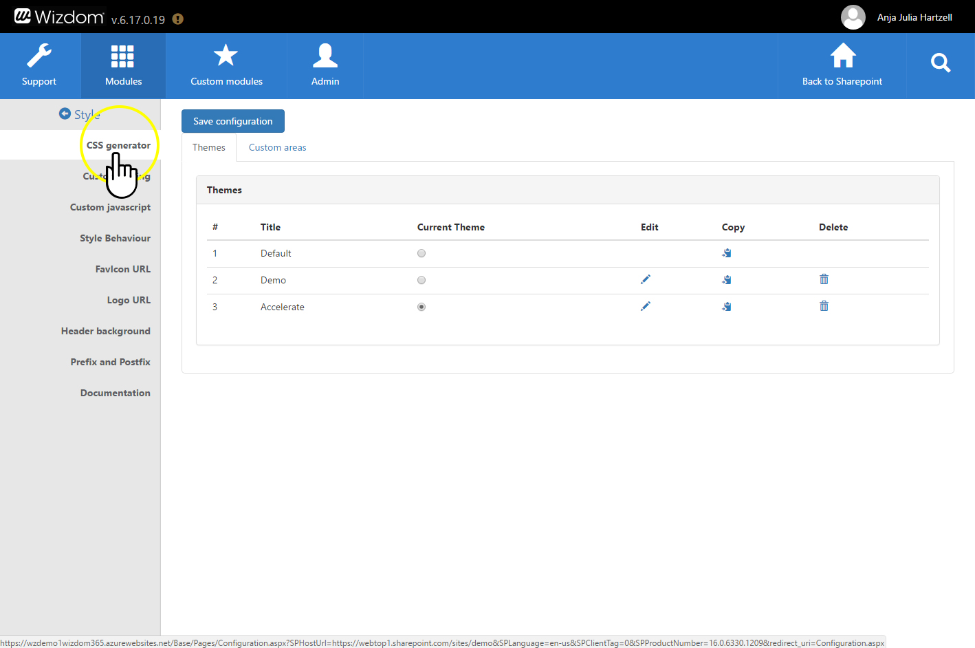
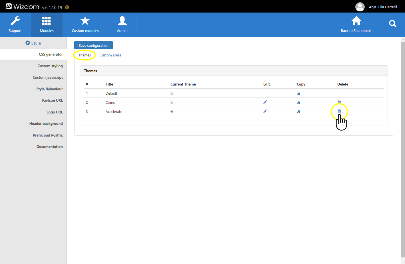
Wizdom comes with two themes out-of-the-box. A default theme plus a theme called ‘Accelerator’. These themes includes a different set of styles that offers different styling options for your solution. If you want to customize the default styles of your site collection or create a completely new set of styles, you need to create a new style theme in the CSS generator. This results from the fact that Wizdom’s default styles can’t be modified.
Creating new style themes
To create a new style theme in the CSS generator, perform the following steps:
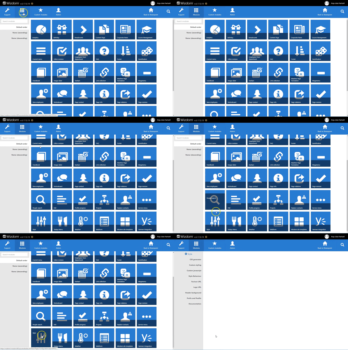
1) Find the the CSS Generator in the ‘Style Module’ in Wizdom Configuration Center.
You find Wizdom ‘Style’ module by navigating to Modules in Wizdom Configuration Center. The modules are sorted alphabetically. Locate ‘Style’ and click on it.
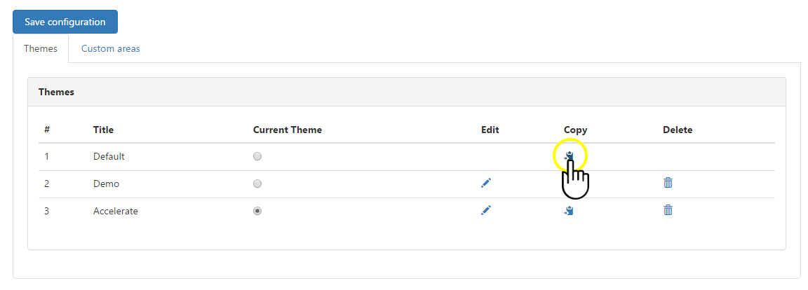
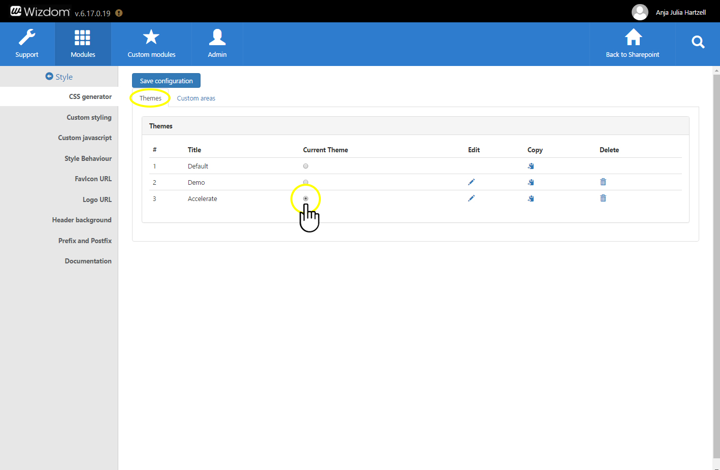
3) Copy one of the existing style themes by clicking the ‘Copy’ icon next to that theme.
Customizing style themes
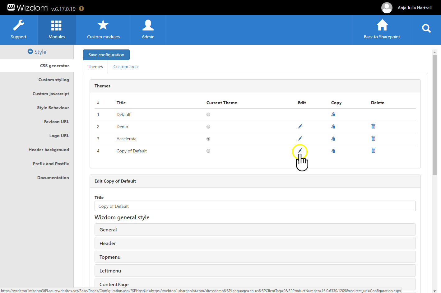
1) Click on the ‘Edit’ icon in the row of the style theme you want to customize.
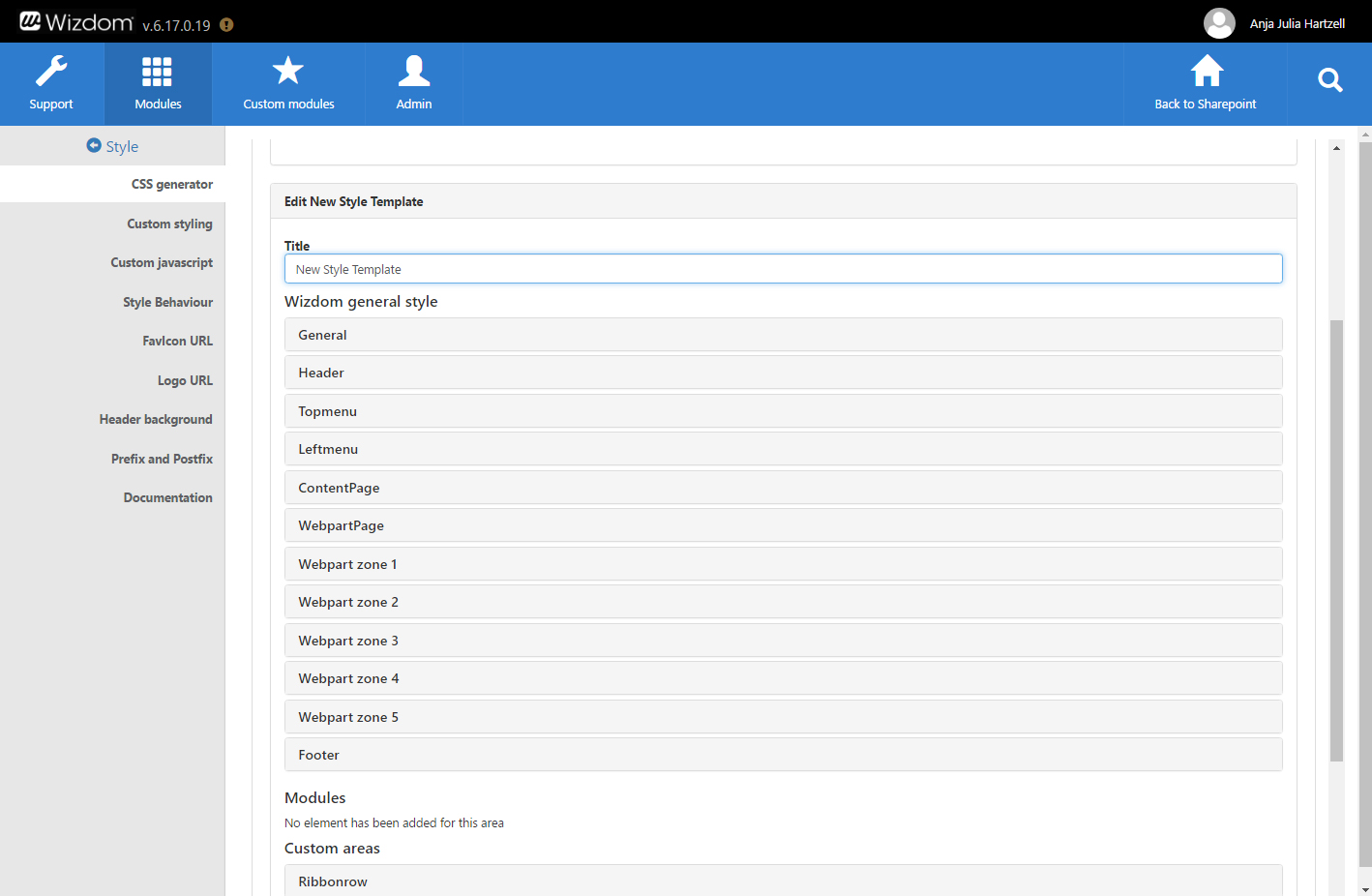
This will present you to an accordion panel of properties for which you can define the style.
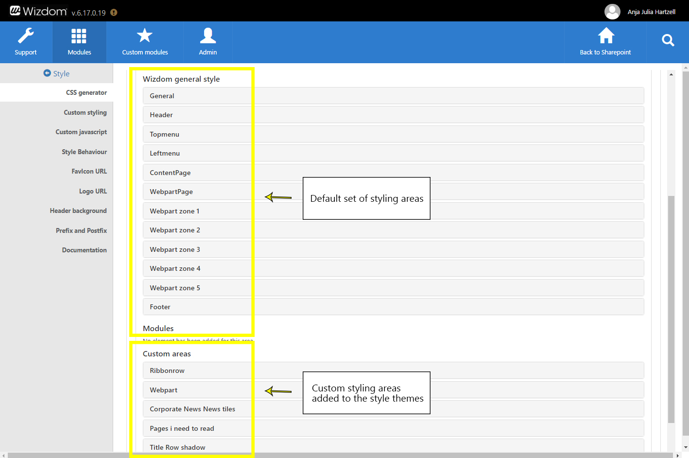
These are grouped into four collections of categories:
Title: Here you define the title of the style theme. The name will help you and other admins identify your style theme and is only displayed in the CSS generator.
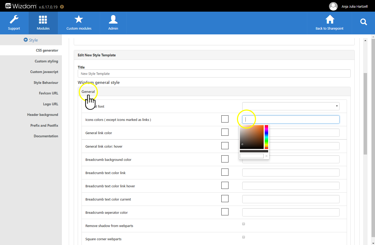
Wizdom general style: This holds a group of styles that can be customized using the CSS Generator. They are grouped into categories that explains their general purpose. I.e under the area ‘General’ you can define styles such as font type, link colors, bread crumb text, and background color.
Modules: If you have created custom modules for your intranet, you will be able to customize the styling of these modules from this section.
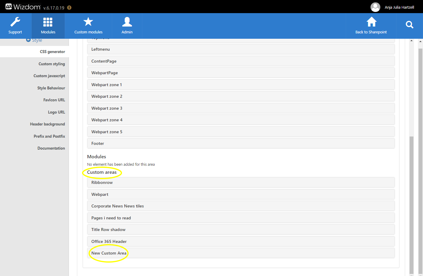
Custom Area: This area contains custom elements and style properties created in the CSS Generator by using the Custom area tab.
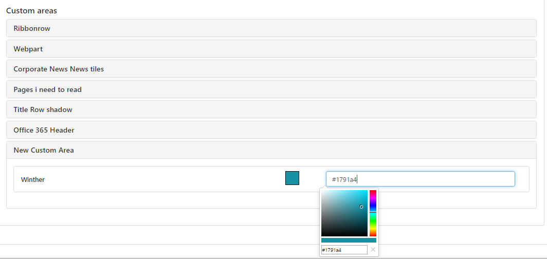
Put your cursor in the field next to the styling options. This will make you able to define styles using color pickers, options from a drop down menu, or check boxes.
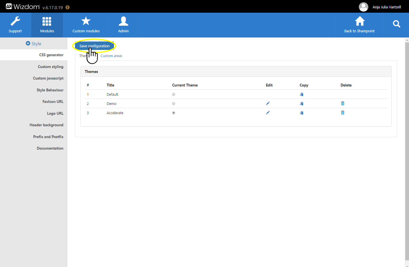
4) Click ‘Save Configuration’ to save the customizations you have made to the style theme.
Custom styling areas
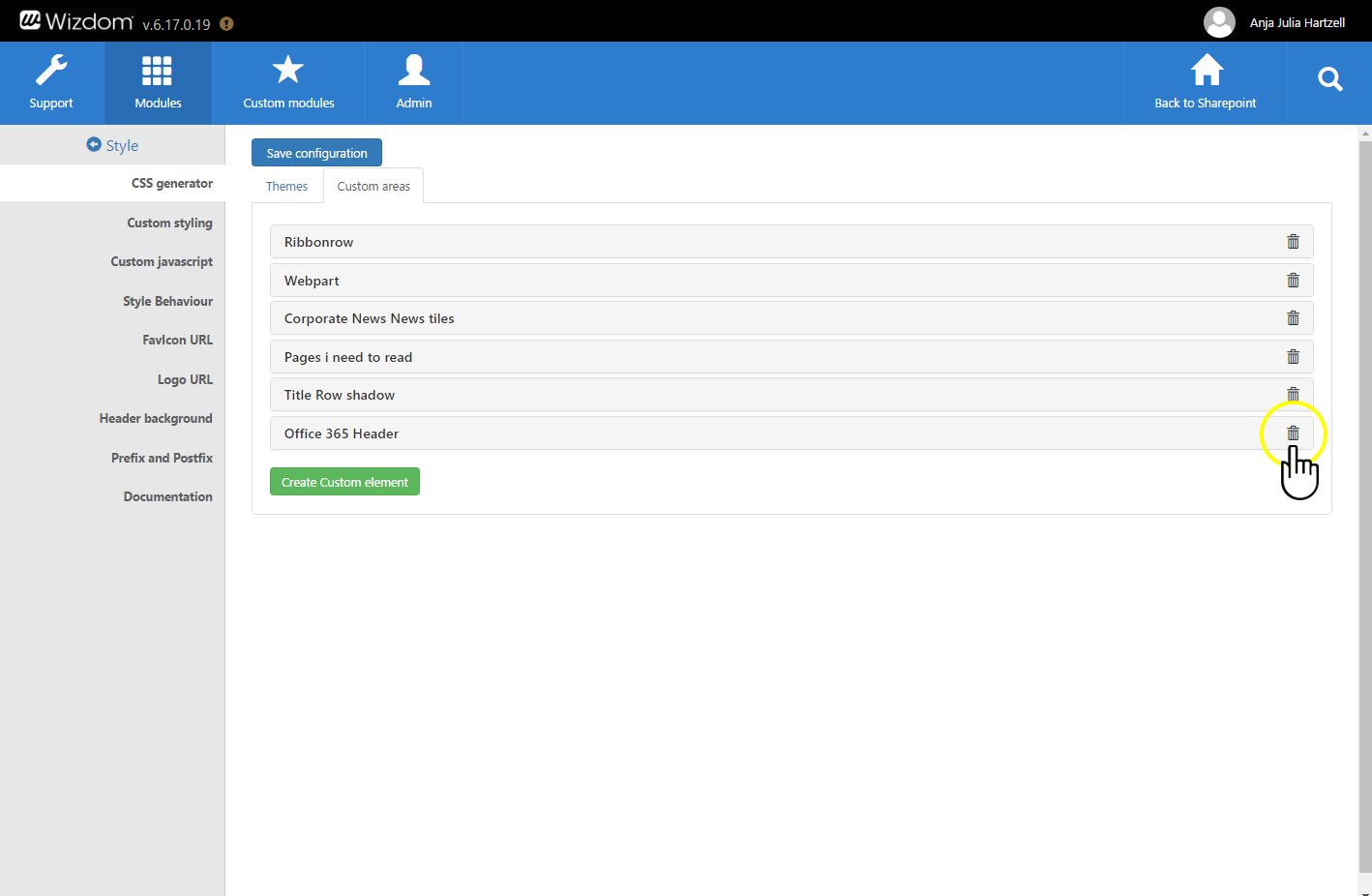
However, If you need to define the style for elements of your SharePoint solution that is not included in this set, admins with developer skills can create custom styling areas that will be added to the style themes. E.g. if you want to add shadows to headers, this is something that you can not carry out by using the default set of styling areas in the style themes. You will then be able to create this styling option in a custom area and add it to the set of areas to style in the style themes.
To create custom areas, perform the following steps:
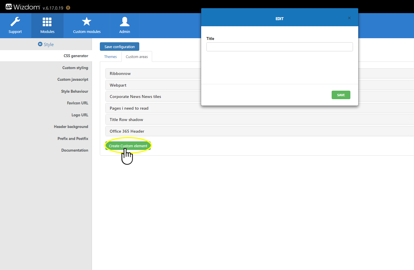
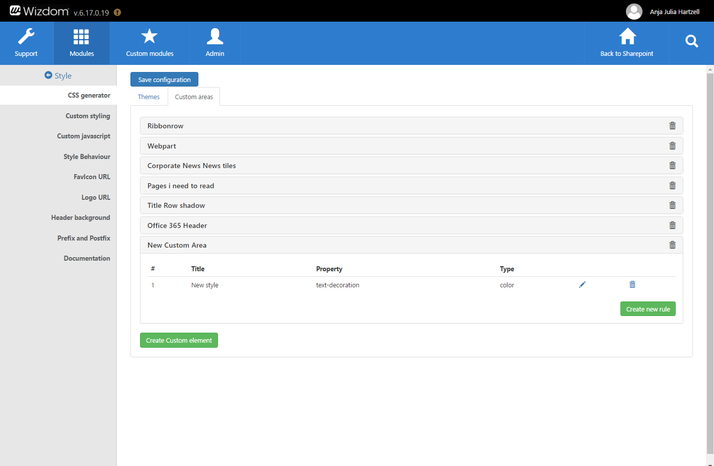
1) Click on the ‘Custom Area’ button in the top left area of the CSS Generator.
2) Next, click on the green ‘Create Custom Element’ button.
A window will appear.
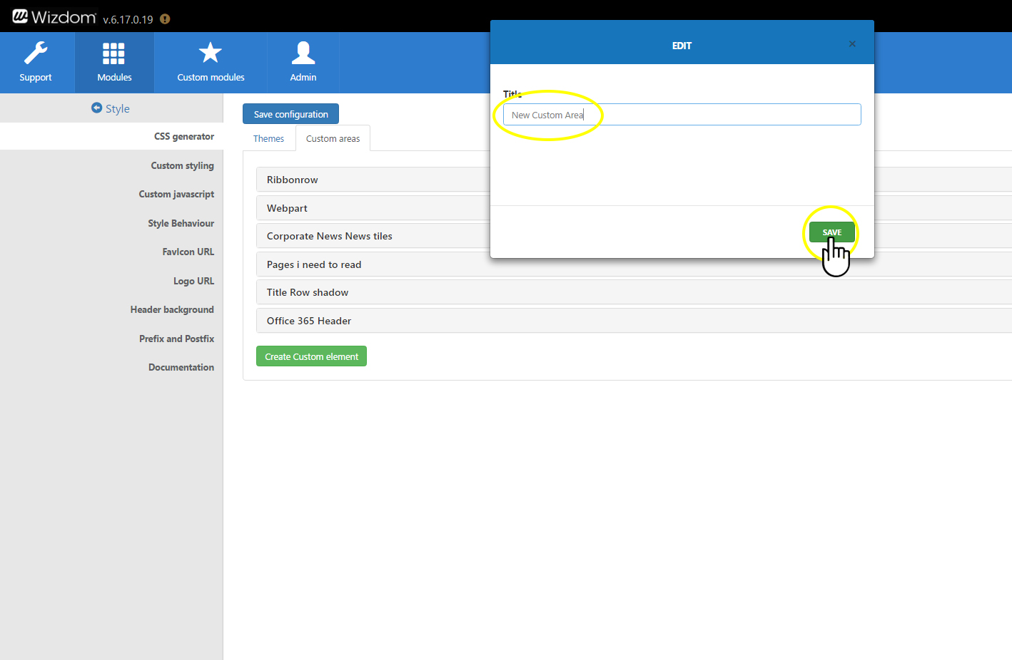
3) Type a name for the custom area, you wish to create, in the ‘Title’ field and click ‘SAVE’. The title will help you and other admins identify your custom area and is only displayed in the CSS generator.
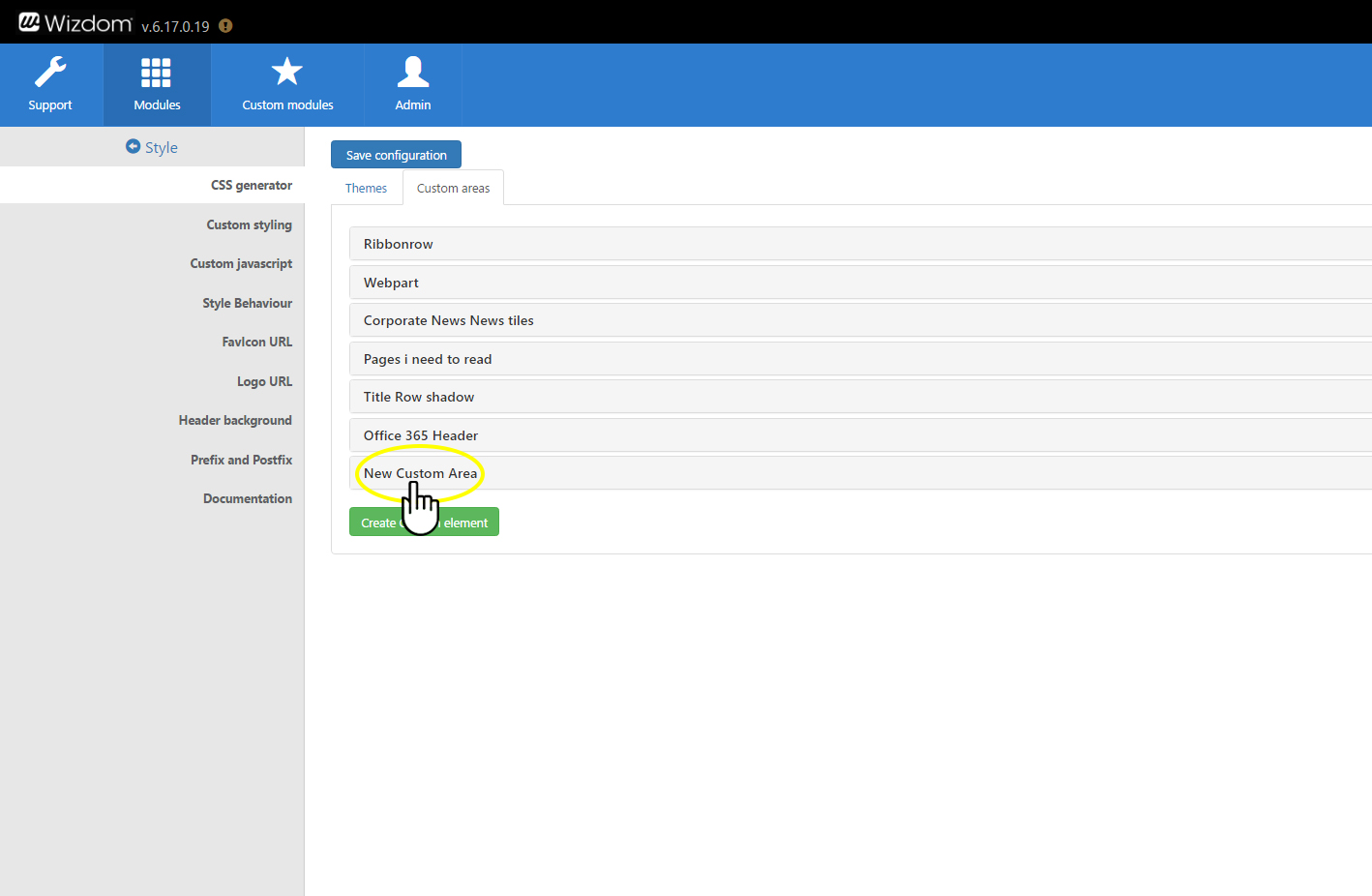
4) A new custom area is created. Now you need to define it.
5) You make it possible to style the custom area by creating rules for it. One rule represents a single style rule – e.g. color of an element. This means, you create a rule for every single style you want to apply to one or more elements.
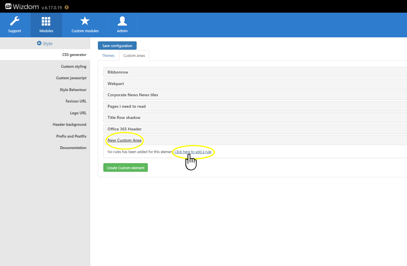
Define a rule by clicking the title of your custom area, and then on the text ‘Click here to add a rule’.
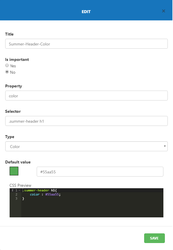
6) In the window that appears, fill in these five fields to create a style rule:
Title: Type a name of the rule that reflects the type and function of the rule. The title will help you and other admins identify the rule and is only displayed in the CSS generator.
Is important: If ‘Yes’ is ticket the important modifier will be set for the style properties in the rule. This ensures that the property will actively try to override properties already present for the style element.
Property: In this field you set the type of style property you want to create a rule for – e.g. background-color, text-align, letter-spacing. The field offers a set of predefined properties that will appear when you start typing. However, you can type in any desired property.
Selector: Is a CSS selector. This is where you define which element in your solution you wish to apply the rule to. In the field you type in e.g. class, id, or attribute of the element you want to style.
Type: Using the ‘Type’ field, you decide how admins can define the property using the CSS Generator.
You decide between 5 alternatives:
- Text generates a text field for any text input.
- Color renders a color picker.
- URL offer a text field for URL input.
- Bool will create a checkbox.
- Select will generate a predefined list of choices.
7) Click ‘SAVE’ to save your rule and add it to the custom area.
Create more rules for the custom area by repeating the steps above.
The custom area and the rules you have applied to it will now appear in the ‘Custom Area’ group in the accordion panel that lets you define the styles of the style themes.

